
Designing an End-to-End Audio Experience
A fully redesigned audio experience with that doubled app usage and increased audiobook consumption by 150%.

About this Project
Project: Mobile-first audiobook experience
Timeline: 12 weeks
Platforms: iOS and Android
Team: 1 PM, 2 designers, 1 lead engineer, 8 engineers
My Role: Co-led strategy, research synthesis, MVP definition, UX and UI design, usability testing, and handoff across platforms.
Outcomes
Increased audiobook downloads and consumption by 150 percent
Doubled overall app usage across iOS and Android
Delivered 5 critical features that resolved the top user pain points
Validated the interaction model with 16 usability testing participants
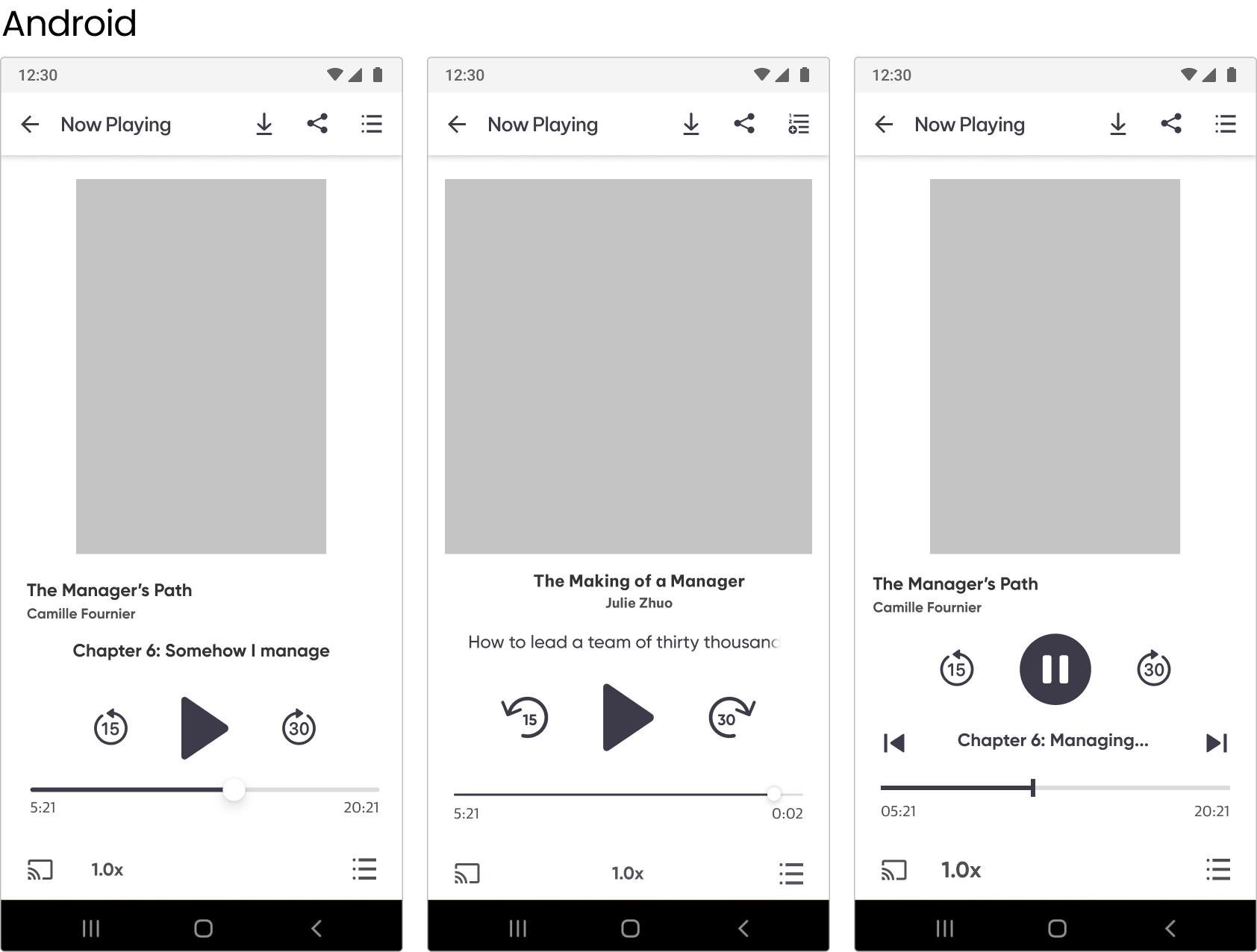
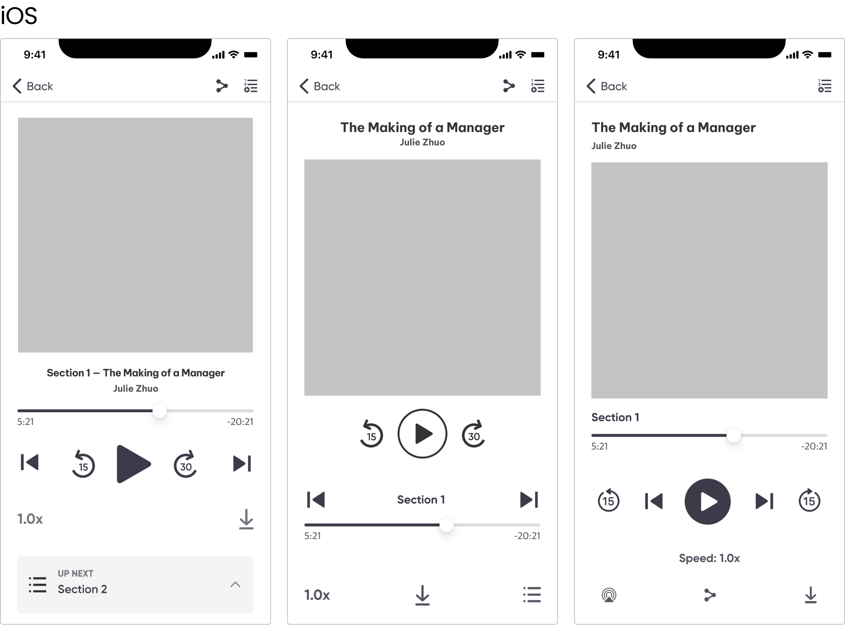
Final Experience Overview
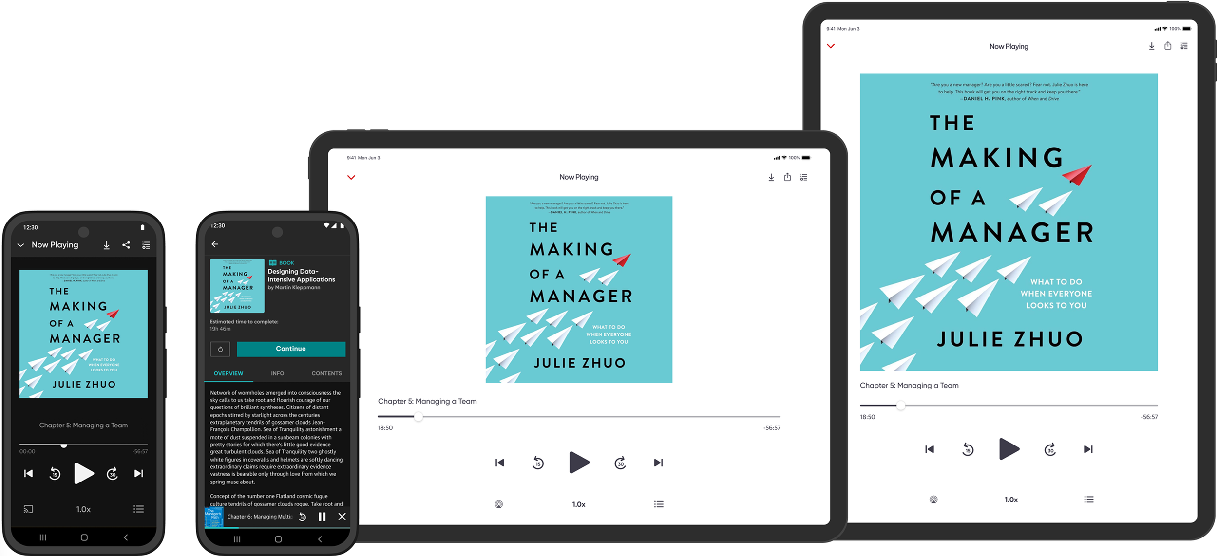
1. Offline download functionality: Flexibility to learn while on the go.
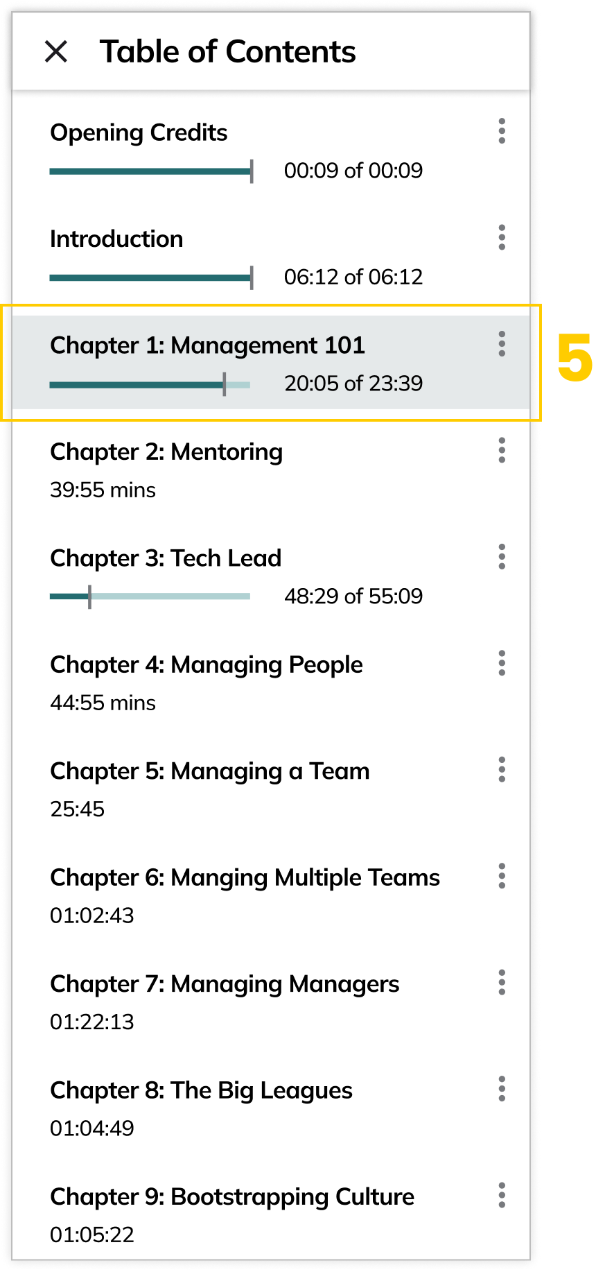
2. Chapter skip: Necessary to quickly access information.
3. Variable playback speeds: Move through the media at a faster pace.
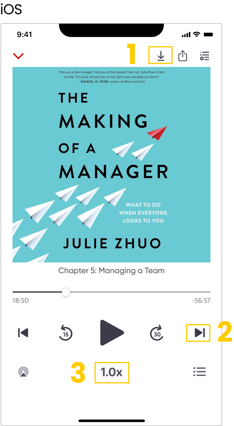
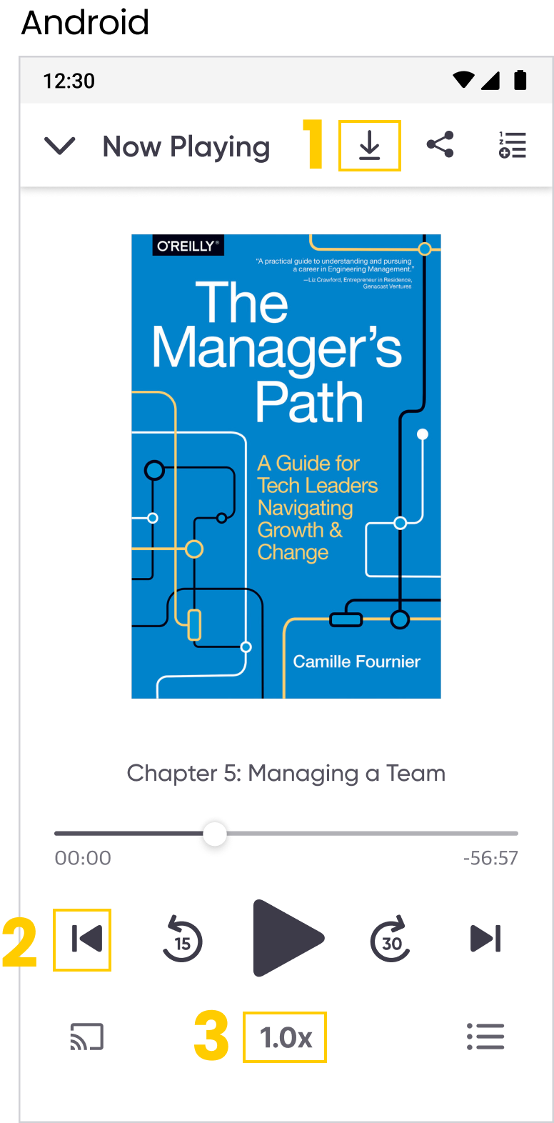
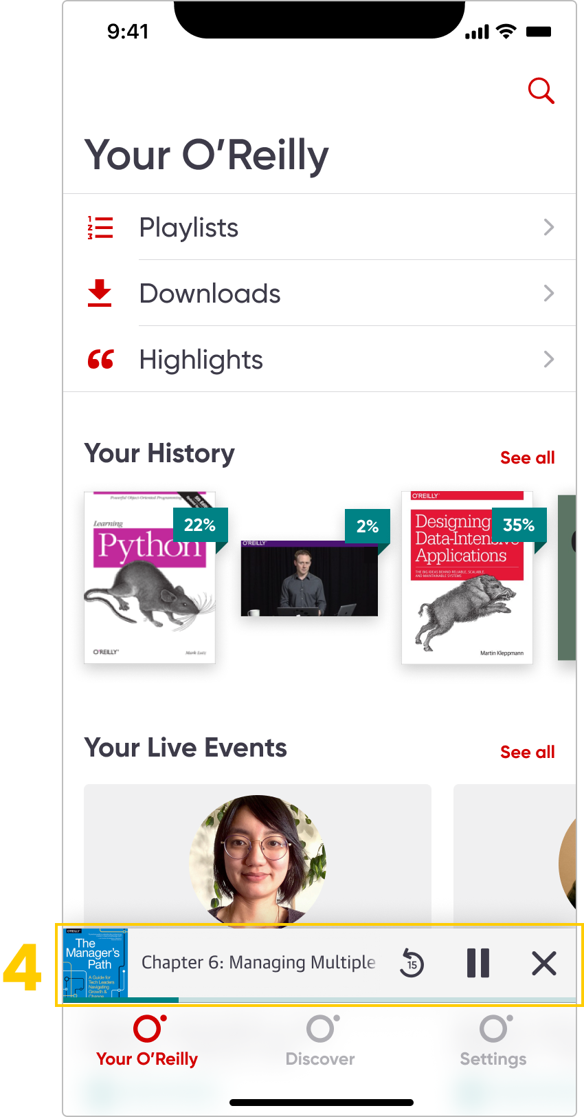
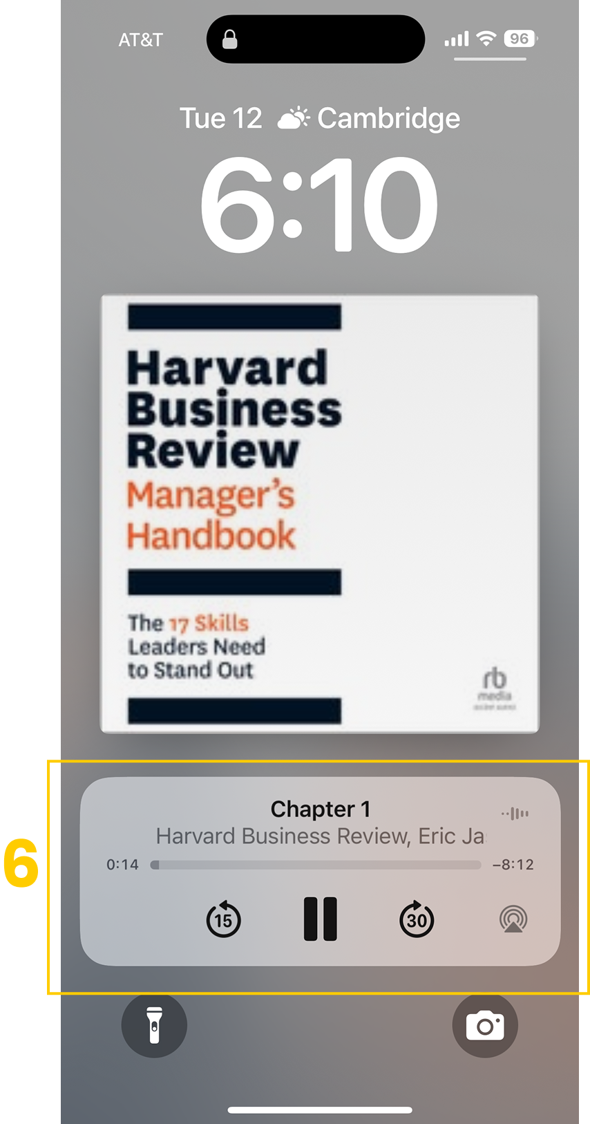
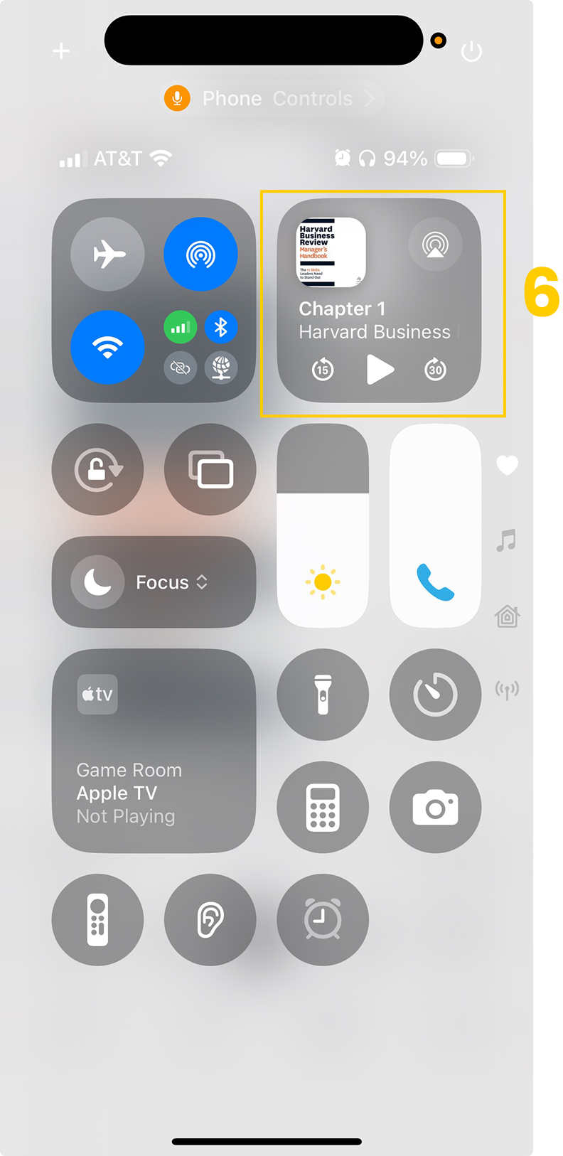
4. Persistent mini-player for easy access: This would give users freedom to multitask.
5. Visual indicator for time left: Quick indicator for user to measure chapter placement.
6. Background playback and lock screen controls
This saves battery life.
Alongside the phone app launch, dark mode for iOS and Android were released, as well as tablet designs which rounded out the experience.
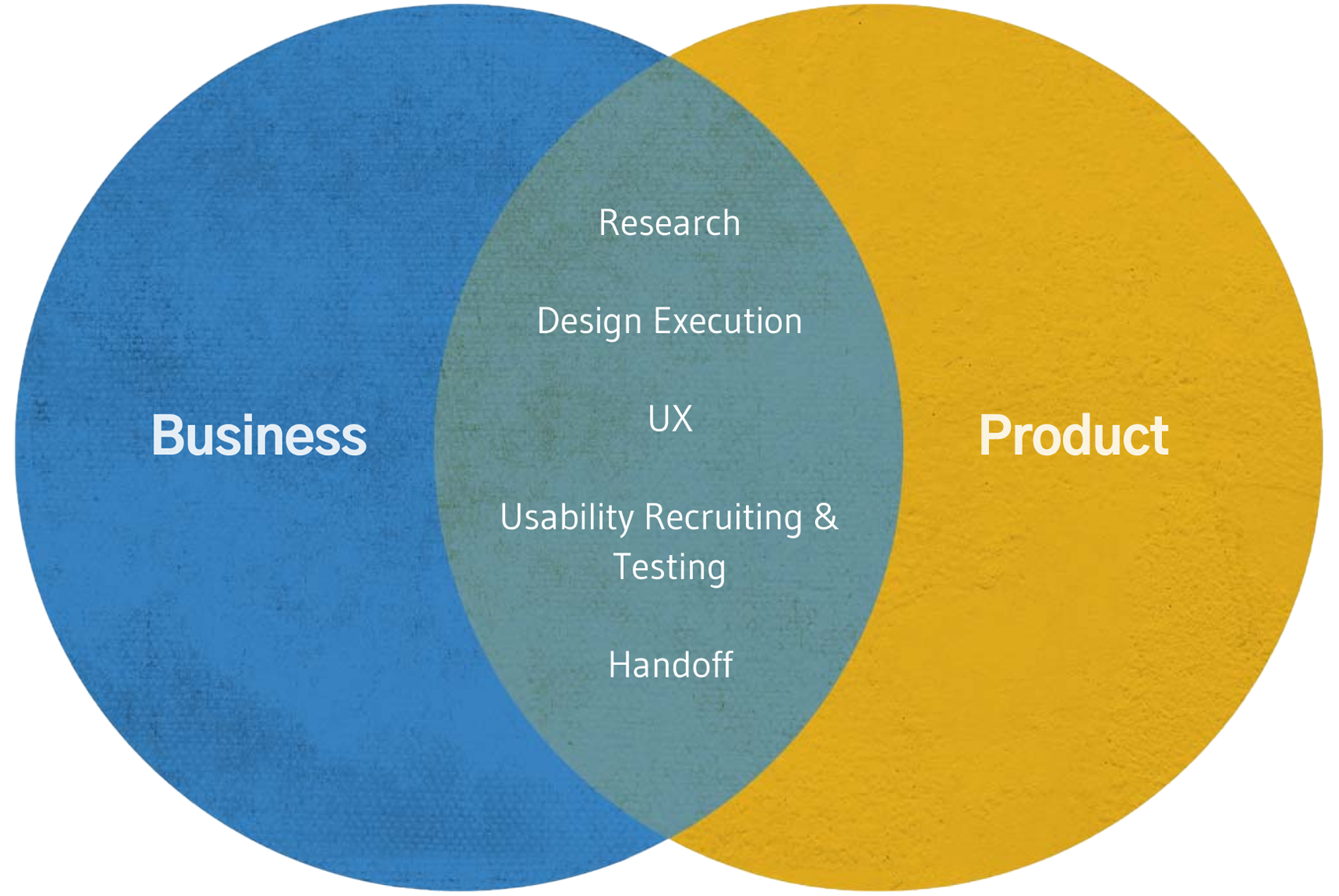
Strategy Snapshot: Aligning User Needs with Business Outcomes
The audio player needed to do more than fix user frustration. It had to support O’Reilly’s broader business goals around engagement, retention, and learning outcomes. My focus was to bridge what users urgently needed with what the company needed to grow, ensuring the MVP delivered measurable impact.
Business Goals I Aligned the Design To
Increase daily and monthly active users
Improve session duration and reduce course drop-offs
Boost audiobook completion rates to support learning outcomes
Strengthen user retention and reduce churn
Encourage cross-platform usage across mobile, web, and tablet
How I Translated These Goals Into Product Direction
Prioritized background playback, lock-screen controls, and a mini-player to support longer, uninterrupted listening sessions
Improved chapter navigation and playback controls to help learners revisit and retain material more effectively
Designed offline-first features so users could maintain access during travel, commutes, and low-connectivity environments
Aligned the UI with O’Reilly’s design system and ensured parity across iOS, Android, and tablets to drive consistent multi-device engagement
My Role & Contributions
I owned:
Research synthesis from 300+ App Store and Google Play reviews
Prioritization of the 5 MVP features with PM and engineering
Mapping and designing core flows for playback, navigation, and downloads
Two rounds of diverge–converge exploration to shape UX and UI direction
Recruitment, task design, and synthesis for usability testing (16 participants, A/B testing)
Creation of cross-platform handoff documentation for iOS, Android, tablet, and dark mode
Support for the staggered release strategy and post-launch analytics definition
How I got There
1. Understanding the Problem
O’Reilly Media is an EdTech SaaS platform that delivers learning through books, videos, live events, and, most recently, audiobooks. Audiobooks should have been a milestone feature, but the launch relied on the existing video player, which was never designed for audio behavior.
Users immediately felt the friction. App Store and Google Play reviews filled with complaints about missing controls, inability to multitask, and poor navigation. Analytics confirmed session drop-offs, and tech debt prevented adding essential audio features like sleep timers, playback speeds, and offline listening.
The business needed a mobile-first audio experience that supported different learning preferences and increased engagement, retention, and course completion. My responsibility was to clarify what the audio experience needed to become and lead the design direction from research through launch.
Audiobooks used the video interface which wasn’t how users were familiar with listening to audio books.
What I did:
Analyzed hundreds of App Store and Google Play reviews
Clustered insights via affinity mapping
Combined qualitative feedback with analytics
2. Defining the MVP
The team needed clarity to avoid scope creep and ship within 12 weeks.
What I did:
Partnered with the PM to translate research findings into feature requirements
Prioritized each feature based on user value and engineering constraints
Scoped bookmarking for post-MVP due to backend limitations
Key insights I uncovered:
Multitasking was broken
Navigation was too rigid for learning
Offline access was missing
Resulting MVP I helped define:
Background playback
Lock-screen controls
Chapter navigation
Variable speeds
Offline downloads
Persistent mini-player
We also needed to maintain:
Cross-device consistency: Users expected seamless transitions between phones, tablets, smart speakers, and car systems.
Accessibility: We needed exceptional design for users with visual impairments, who rely heavily on audio interfaces.
Brand integration: The player had to feel native within O'Reilly's existing design system, not like an unreleated feature.
3. Designing the Experience
Audio-first interaction patterns needed to feel native, intuitive, and consistent across platforms.
What I did:
Led UX flows and early hierarchy mapping
Drove two rounds of diverge & converge exploration
Helped shape UI direction and new components aligned to the O’Reilly design system
The diverge-converge approach allowed my design partner and myself to explore a wide range of UI ideas before moving into low fidelity.
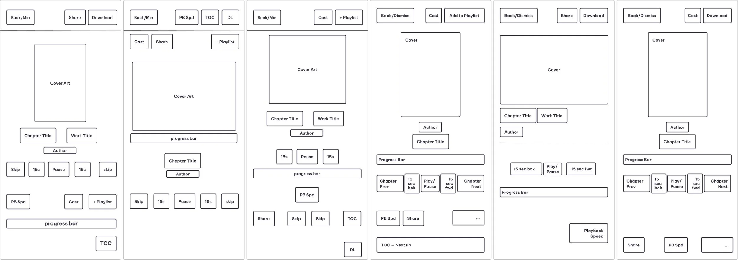
Low fidelity helped solidify the UI which allowed me to move into high fidelity and align components to the O’Reilly design system.
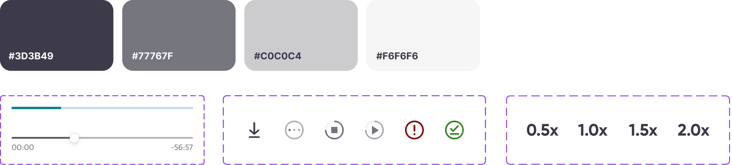
I made sure the components added to the design system followed the same design patterns that were already well-established on the platform. Due to a predominately neutral UI, three additional tints of gray were added that build off the darkest shade of gray that was already implemented within the color palette.
4. Validating with Users
The team needed certainty that the new model matched user expectations.
What I did:
Recruited 16 participants
Designed 10 task scenarios
Conducted and synthesized the A/B test results
Key findings:
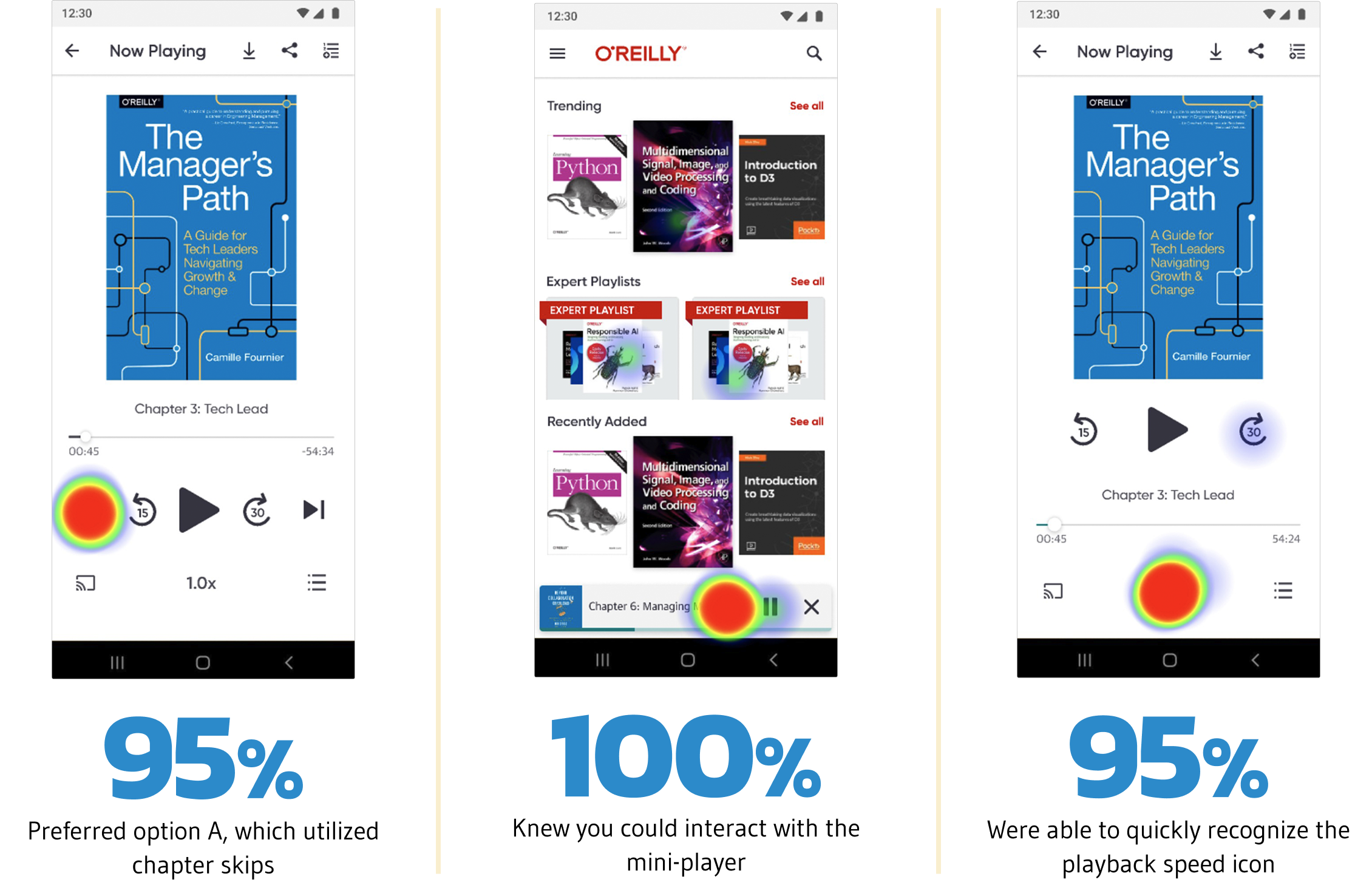
95 percent preferred chapter skip
100 percent understood mini-player interactivity
95 percent identified playback speed controls
Launch & Impact
What I did:
Created detailed handoff documentation across iOS and Android
Worked with engineering to maintain platform parity
Supported the staggered release of the core player and mini-player
Defined the measurement plan using Amplitude and FullStory
Business impact:
150 percent increase in audiobook consumption
2× app usage across two platforms
Clear path for future audio roadmap (bookmarking, sleep timer, accessibility)
What I Learned
Clear requirements keep teams aligned and prevent scope creep.
Engineering partnership is essential for feasibility, parity, and scalability.
Asking better questions improves decisions and reveals backend constraints.
Understanding platform limitations early leads to more realistic MVPs.
Documentation is a force multiplier during development and beyond.