
Increasing Live Event Registration 26% Through Native App Design
Quick Overview
The Challenge
Design a native Live Events experience that brought O'Reilly's growing virtual conference business to mobile for the first time, increasing accessibility and driving registration among mobile-first subscribers. The third-party platform that hosted the Live Events did not adequately support mobile devices.
Role & Context
I was the solo designer, partnering with a Product Manager, Lead Engineer, and engineering team split across iOS and Android.
Timeline
3 month timeline with discovery through launch across two platform releases.
Constraints
Live event infrastructure ran on On24, a desktop-first platform with no mobile support
Two platforms to ship in parallel: iOS and Android
Needed to align with existing O'Reilly design system and native platform patterns
3 Strategic Decisions
Designed around a constraint I couldn't change
Live Events ran on On24, a platform built for desktop-first experiences. I created a section on the detail screen and wrote copy directly advising users when a larger device would serve them better.Simplified registration after exploring a more ambitious direction
Early exploration produced a ticketing flow with digital confirmation intended to honor the prestige of O'Reilly's in-person conferences. However in the end I ruled it out. The ceremony undermined the clarity users needed, and I reduced registration to a single action.Introduced a native-only countdown experience
I designed a live countdown timer that begins when users receive their 24-hour reminder, with the Join Now button appearing at 15 minutes out. The web platform had no equivalent at launch and later adopted the same timing threshold.
What Shipped
Discovery of Live Events by adding a New badge within content
Live Event format filter integrated into Search
Your Live Events section on Your O'Reilly landing screen with card states across the full event lifecycle
Detail screen designed for 8 distinct states from default through post-event recordings
iOS and Android implementations using platform-native components throughout
Impact
26% increase in registration totals at launch
12% native app join rate
31% increase in platform-wide join rates, reflecting stronger cross-platform follow-through from registered users
Context
O'Reilly's conference business went fully virtual during Covid, becoming Live Events - a growing part of the platform experience that drove strong subscriber engagement across the web. With registrations and join rates climbing, the initiative expanded to bring Live Events to the native iOS and Android apps, with the goal of increasing accessibility and driving registration among mobile-first subscribers.
I owned the full native experience end to end, from early scoping through launch and QA.
My first step was to work with the platform Live Events team to understand the complexities with various states and edge cases, then map the full detail screen in lo-fi to establish the content hierarchy and identify the scope of states the screen would need to support.
Discovery
Live Events needed to be discoverable from day one, not as a standalone destination, but woven into the places subscribers already were.
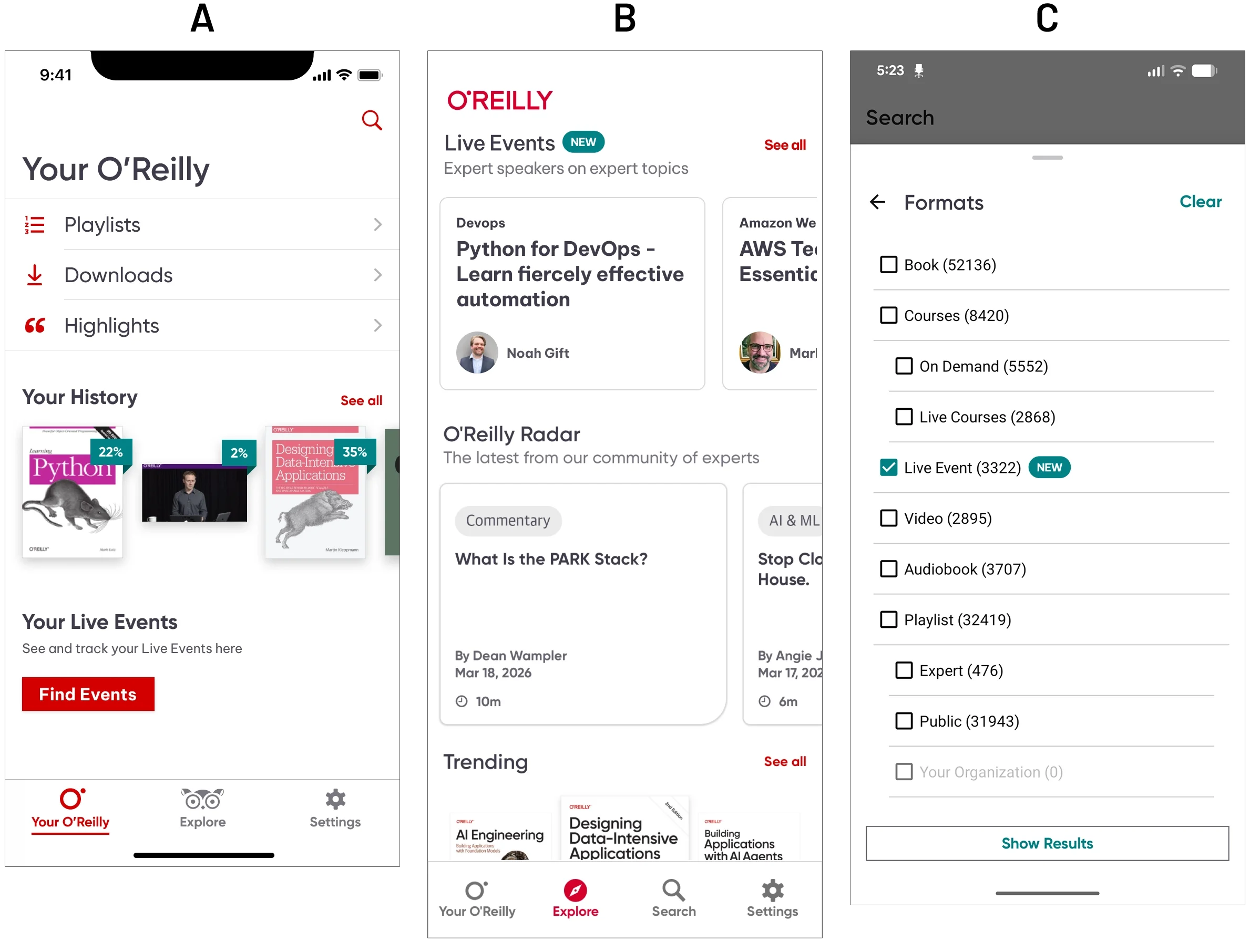
(A) The primary launch entry point was the Your O’Reilly screen, which users landed on when opening the app. By adding a Live Events section, users could easily move into the new feature, making discovery easier.
(B) I also included a dedicated shelf at the top of Explore, badged "New" to signal the addition. This placement gave Live Events immediate visibility during launch, though it was later deprioritized as the feature matured into the broader platform.
(C) Live Events was also integrated directly into Search as a filterable format, sitting alongside Books, Courses, and Video rather than living in a separate section. That decision mattered: it positioned Live Events as a first-class content type within O'Reilly's existing mental model, not a bolted-on feature.
I typically begin my work in low fidelity, but because discovery was happening within areas that were already established within the app, I moved discovery straight into high fidelity.
Low Fidelity: Details Page
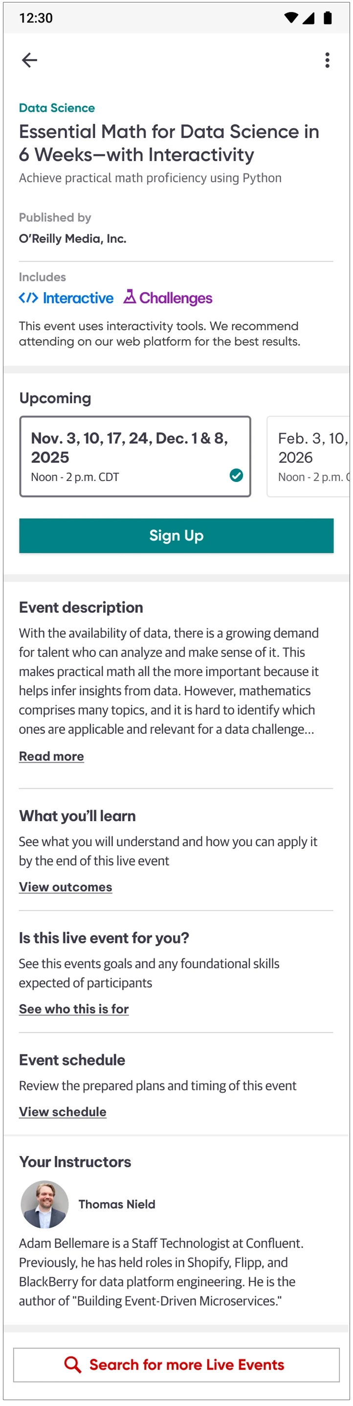
I explored a variety of layouts, but after speaking with stakeholders and engineering, I broke the details page down into 3 sections due to the complexity of the event, and because of the very high possible states it could be in. It was broken down into a:
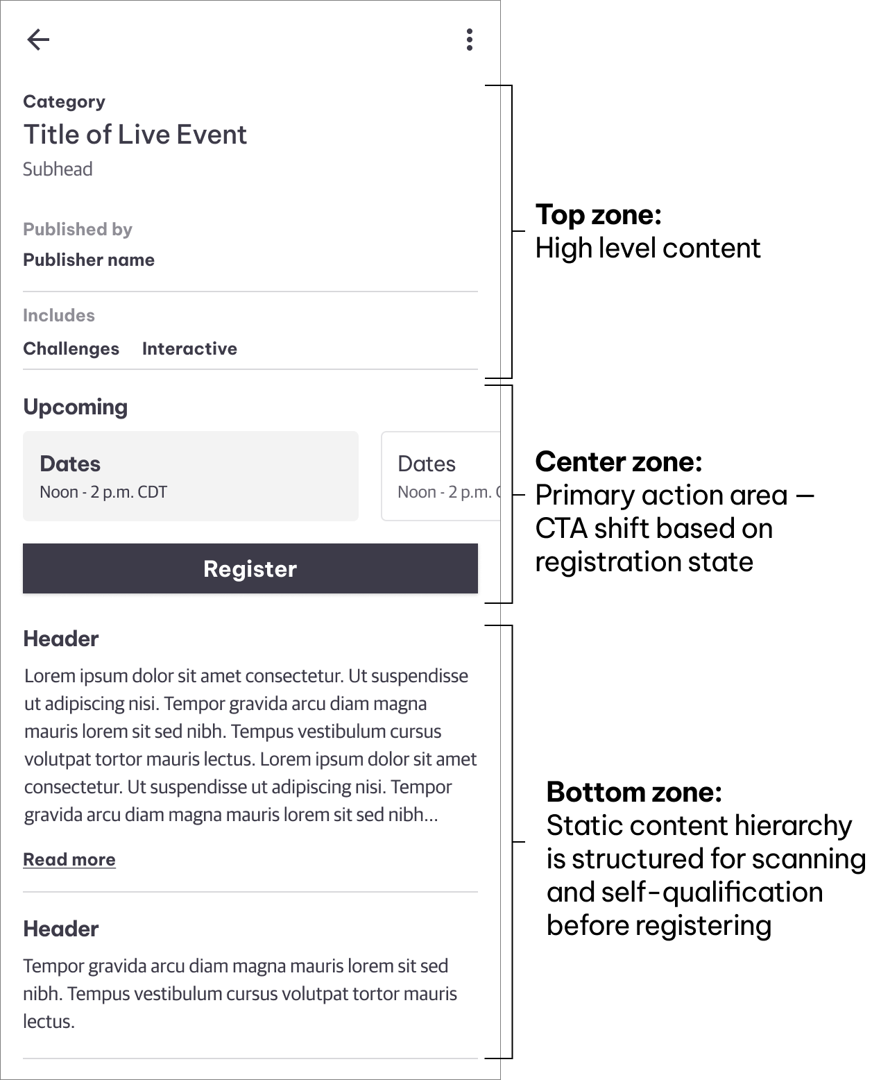
Top zone for high level content - Easily scannable data like title, publisher, and important information worth surfacing, like whether the event had a sandbox which required a larger viewport.
Center zone as primary action area - Interactable area with dates and a registration button so users could easily register for the upcoming event.
Bottom zone static content - Event details that informed the user whether or not the event would be a good fit.
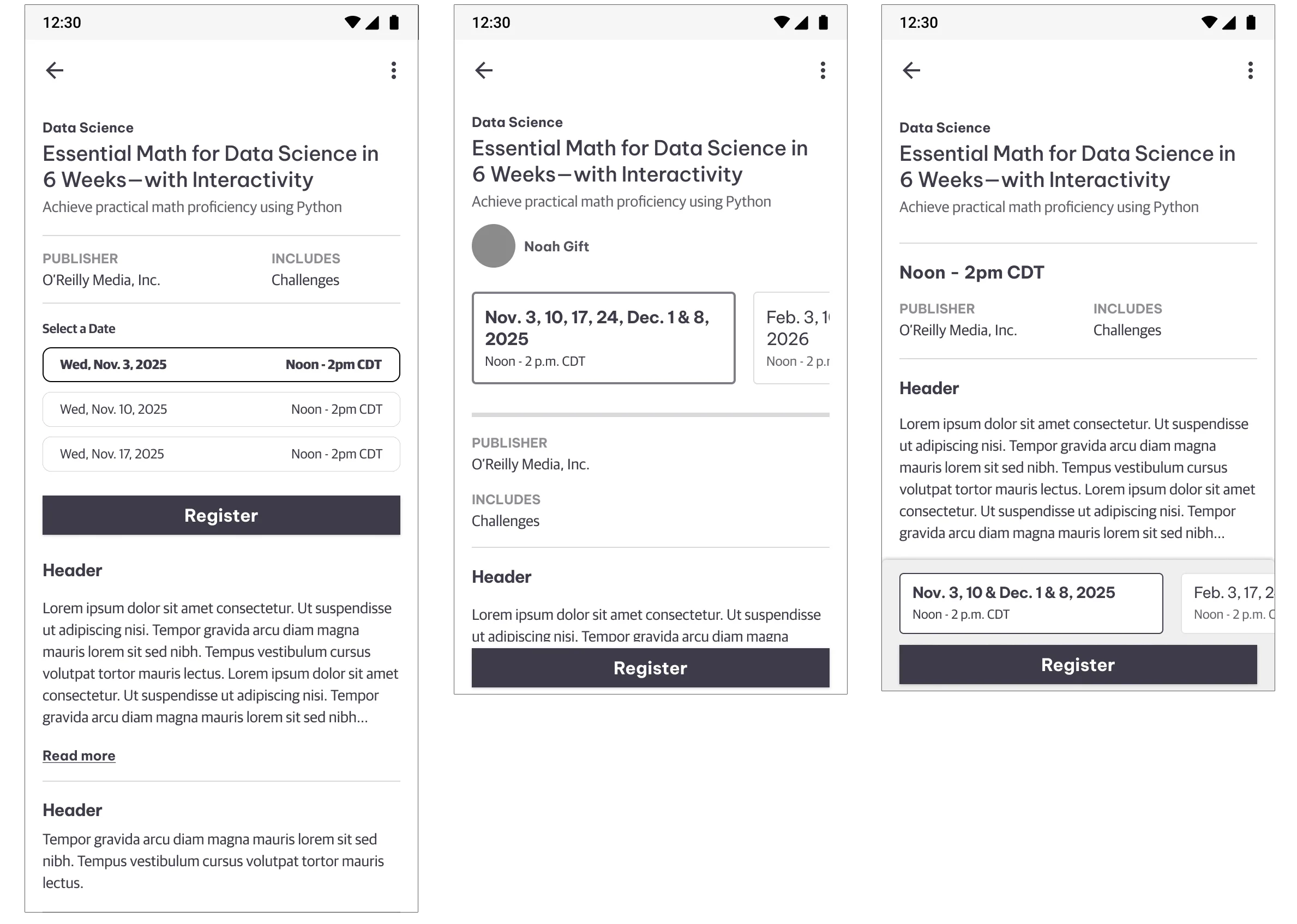
Low fidelity explorations
The detail screen was split into 3 distinct sections to keep up with the various states
I was able to utilize a majority of design system components to lock in the look & feel which saved time on the back end.
Designing Around a Third-Party Constraint
Live Events ran on On24, a platform built for desktop-first experiences. Certain session types - particularly those involving interactive elements or coding challenges - weren't fully viable on mobile.
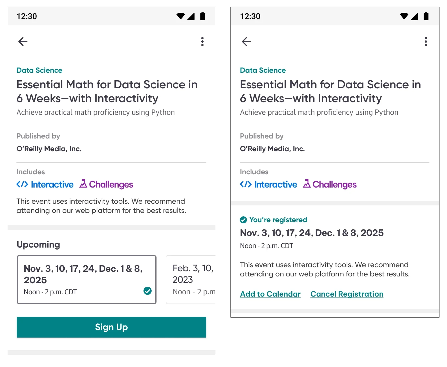
On O’Reilly’s platform side, interactivity and challenges were surfaced as additional information, but on something with limited real estate, it was very important to not only surface it but call it out separately. I dedicated a section called “Includes” to separate it from everything else. I used the same iconography our users were accustomed to on the platform side and wrote copy, recommending the usage of the web platform for the best experience. That notice appears twice intentionally. Pre-registration it sits below the Includes icons as passive context, visible to anyone evaluating whether to sign up. Post-registration it moves into the confirmed date section and is surfaced at the moment it's most actionable - when a user has committed and needs to know how to prepare.
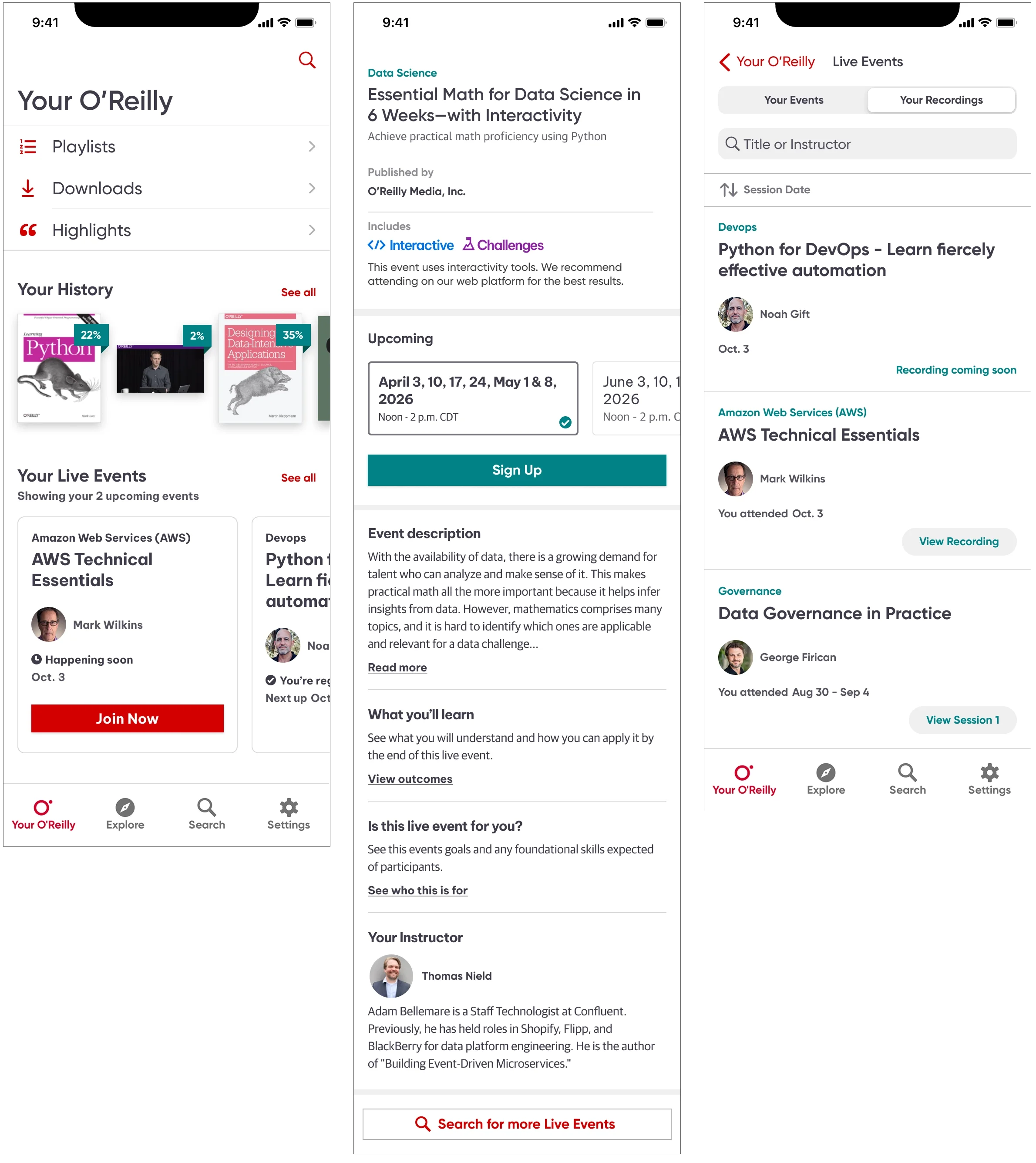
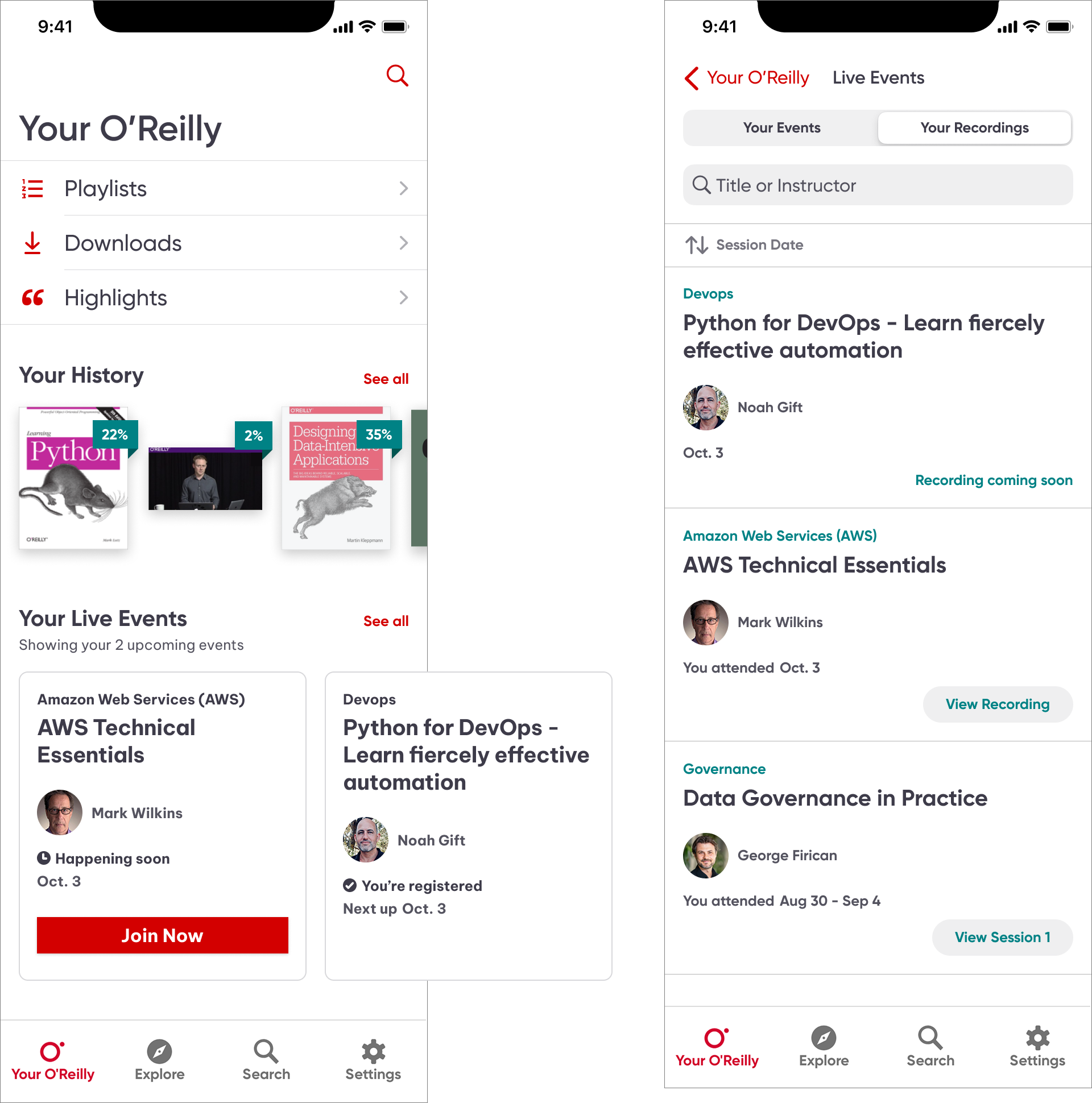
Your O'Reilly — the event in context
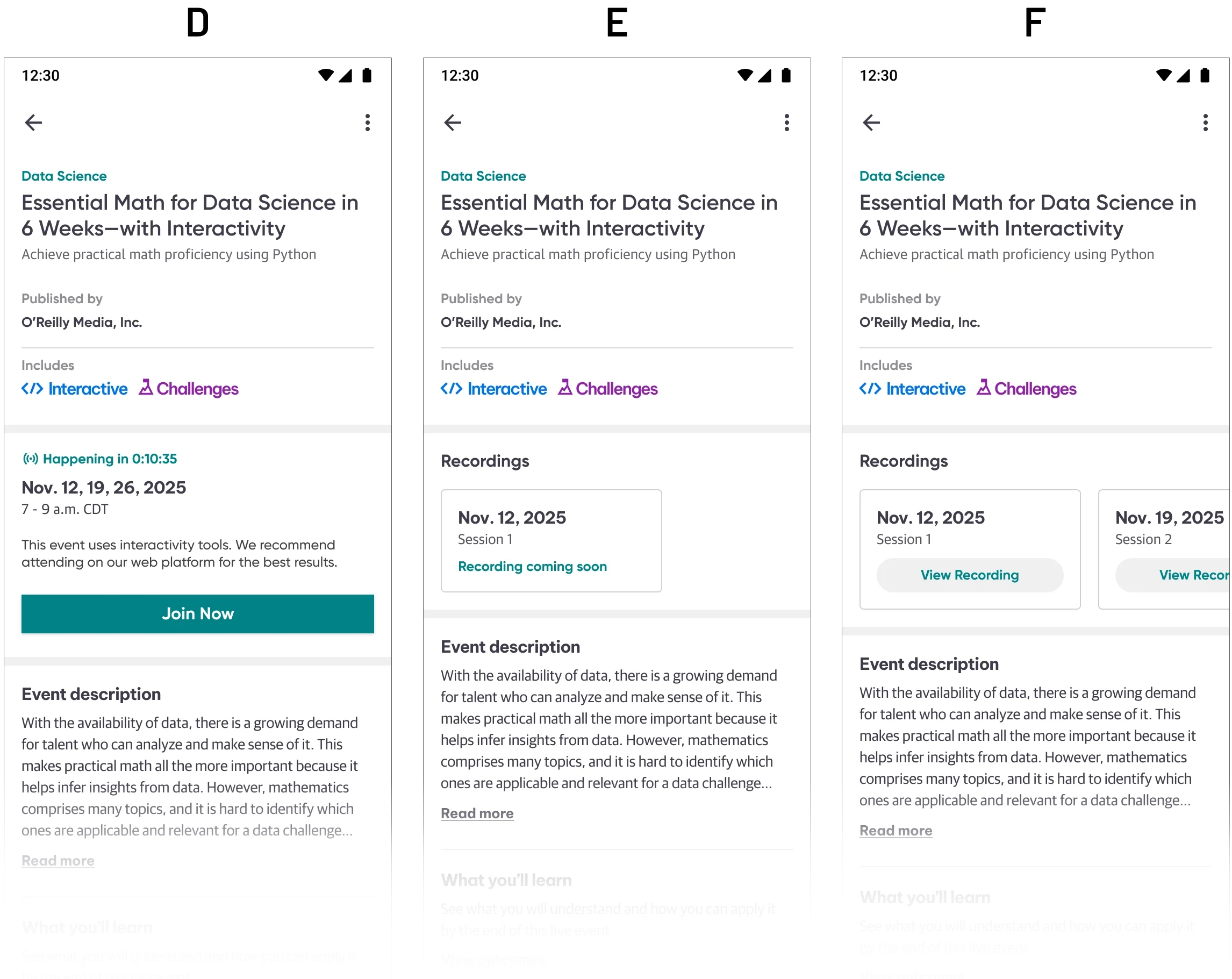
Once a user registered for their first Live Event, a card appeared on their Your O'Reilly landing screen. Cards carry two states: Happening Soon, which surfaces a Join Now CTA as the session approaches, and You're Registered, which shows the next upcoming date at a glance.
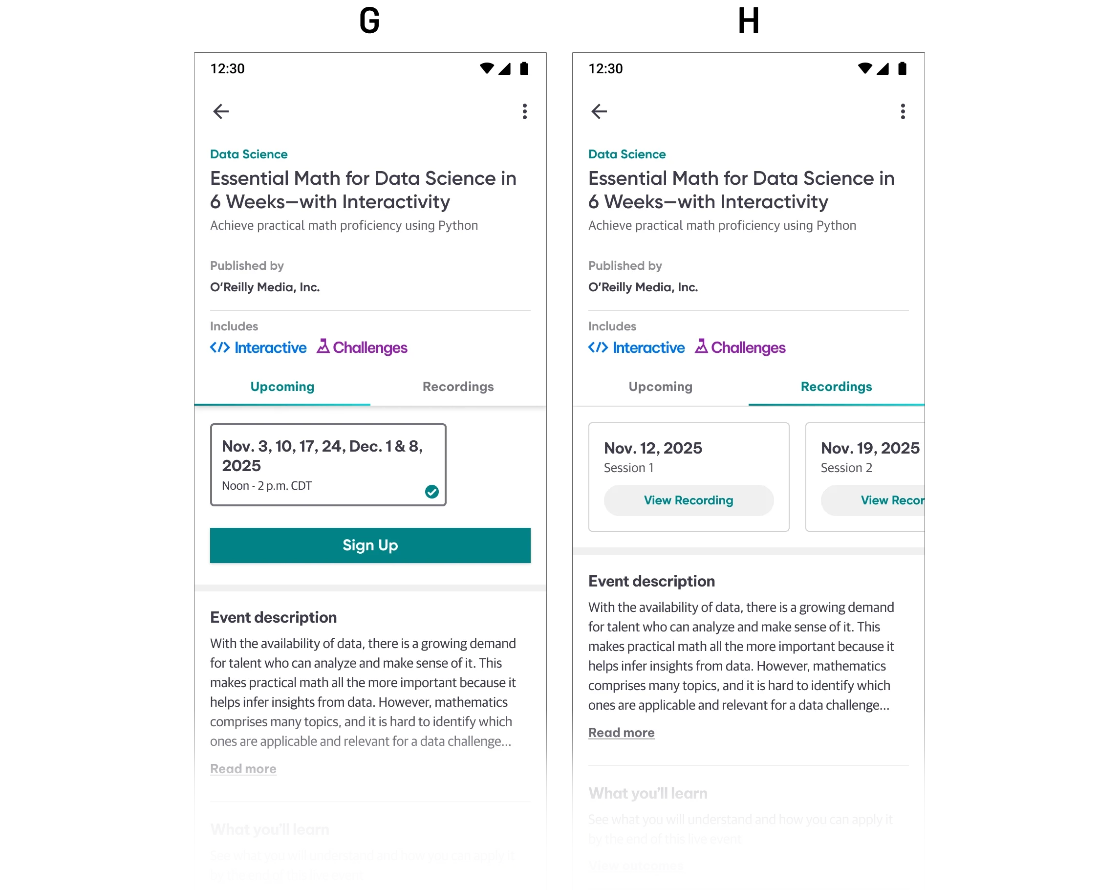
Past events live one level deeper. Tapping See All opens the full Live Events view, where a segmented control separates Your Events from Your Recordings. The Recordings tab manages its own state arc: Recording Coming Soon while content is being processed, transitioning to View Recording for single-session events and View Session for multi-session events once each is available.
That separation of active events on the surface, recordings tucked one level down was a deliberate hierarchy decision. The landing screen stays focused on what requires action. The archive is there when you want it, without competing for attention with an upcoming event.
Designing for State Complexity
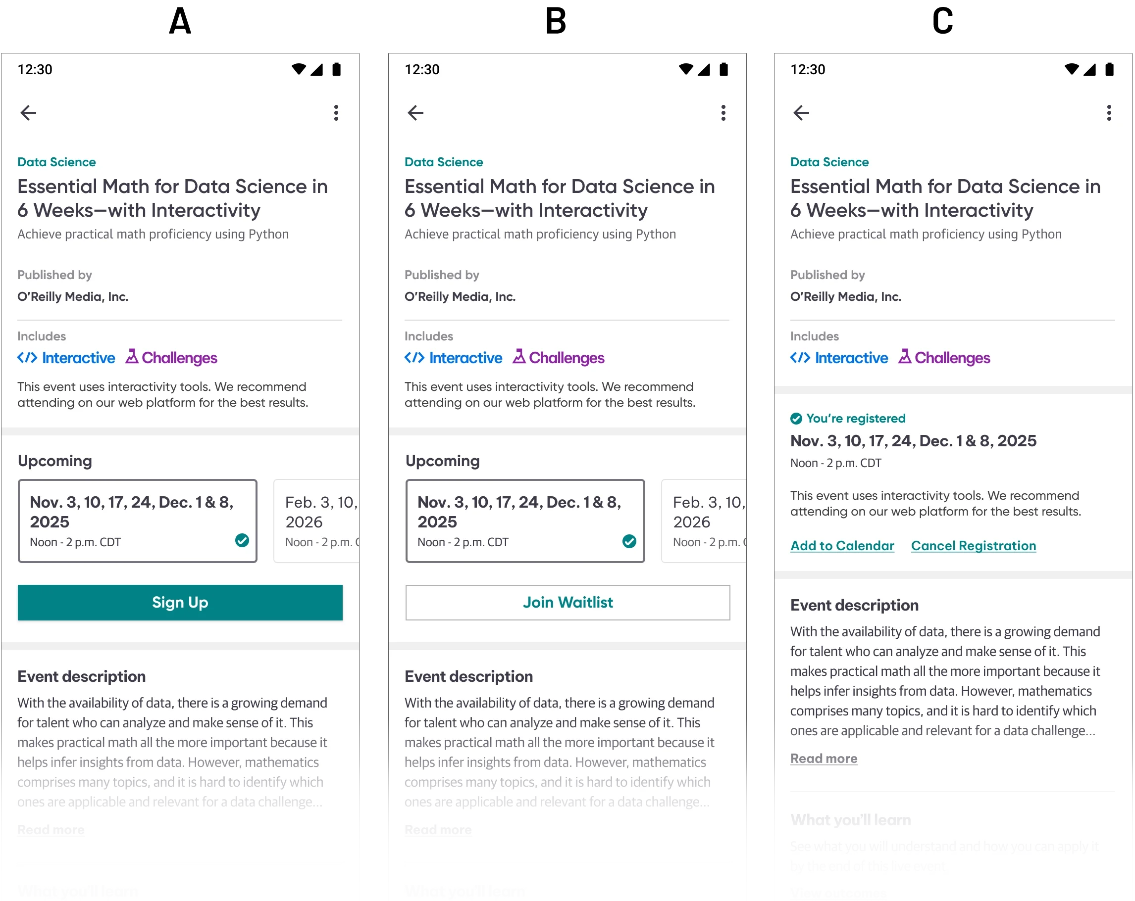
The detail screen was the most demanding design challenge in the project because it had a single view that had to communicate clearly across dozens of distinct states depending on where a user was in their relationship to an event. The standard I held across every state was the same: a user should never land on this screen and wonder what to do next. Defining three distinct areas - top, center, and bottom zones, kept the detail page organized, cohesive, and easily scannable.
(A) Default: The default view surfaces what matters most immediately: event type, the Includes iconography, upcoming dates as horizontally swipeable cards, and a clear primary action. The event detail content below is heavily copy-driven by nature, so I used the established type system to build a clear hierarchy which was the event description, what you'll learn, prerequisites, event schedule, and instructors. They were organized so a user could scan and self-qualify before registering.
(B) Waitlisted: When a date is full, the primary action shifts to Join Waitlist. The information hierarchy stays consistent; only the CTA and status change.
(C) Registered (multiple sessions): Confirmation surfaces in the center zone. The selected date is highlighted within the swipeable date cards, with a checkmark to offer a second way to indicate selection. Add to Calendar and Cancel Registration replace the Sign Up CTA, both of which required direct engineering collaboration, since each carried technical complexity beneath the surface.
(D) Countdown: When the 24-hour reminder email goes out, a live countdown begins on the detail screen. I set the threshold for the Join Now button to appear at 15 minutes out, which was early enough for users to settle in, without opening the session so far in advance that it lost urgency. This was a native-only feature. The web platform had no equivalent at launch, and later adopted the same timing.
(E) Single session recording: Once a single-session event concludes, the Upcoming section transitions to Recordings. A Recording Coming Soon state manages the gap while content is being processed.
(F) Multi-session recordings: For multi-session events, individual View Recording cards appear per session as each becomes available, rather than waiting for the full event to be processed. The screen handles a mixed state where some sessions available and others still processing, without requiring the user to leave the detail screen they already know.
(G) Attended, upcoming date available: For recurring events, the screen surfaces the next available date directly after attendance, allowing re-registration without navigating away.
(H) Attended, multiple sessions: The fully attended multi-session state, where all recordings are available and the event arc is complete.
Outcome & Reflection
After launch, registration totals increased 26% — the clearest measure of what bringing Live Events to native actually unlocked. The native app join rate was 12%, and platform-wide join rates increased 31% total. The data told a complete story: users were registering on mobile and attending on desktop, where sessions were tracked independently. The app was doing exactly what a mobile-first entry point should do, converting intent into participation at the top of the funnel, and handing off cleanly to the platform best suited for the full session experience.
What made this project demanding wasn't any single design problem. It was holding a complex state system together across dozens of scenarios, designing around a third-party constraint I couldn't change, and making the call to simplify registration after genuinely exploring a more ambitious direction. Every significant decision I made prioritized user trust and clarity over design ambition.
The most invisible design work is often the most important. A user moving from discovery to registration to attendance without friction rarely notices how many decisions went into making that feel effortless.