Increasing Audiobook Engagement 150% Through Native Playback Design
A fully redesigned audio experience that doubled app usage and more than doubled audiobook consumption.

Quick Overview
The Challenge
Design a native audio player that transformed O'Reilly's basic playback workaround into a real listening experience, addressing early-session abandonment and increasing audiobook content consumption.
Role & Context
I was the solo designer and partnered with a Product Manager, Lead Engineer, and 8-person engineering team split across iOS and Android.
MVP Timeline
12 weeks from discovery through launch
Constraints
12-week timeline
Backend-heavy foundations and cross-device continuity requirements
Two platforms to ship in parallel: iOS and Android
Needed to align with existing O'Reilly design system and patterns
3 Strategic Decisions
Grounded design in real listening behavior
Analyzed social comments on the AppStore and GooglePlay, conducted landscape analysis of 15+ audio apps (Spotify, Audible, Pluralsight, Libby) and utilized Amplitude and FullStory analytics to understand what I should focus on for the MVP feature set.Prioritized features that eliminated abandonment triggers
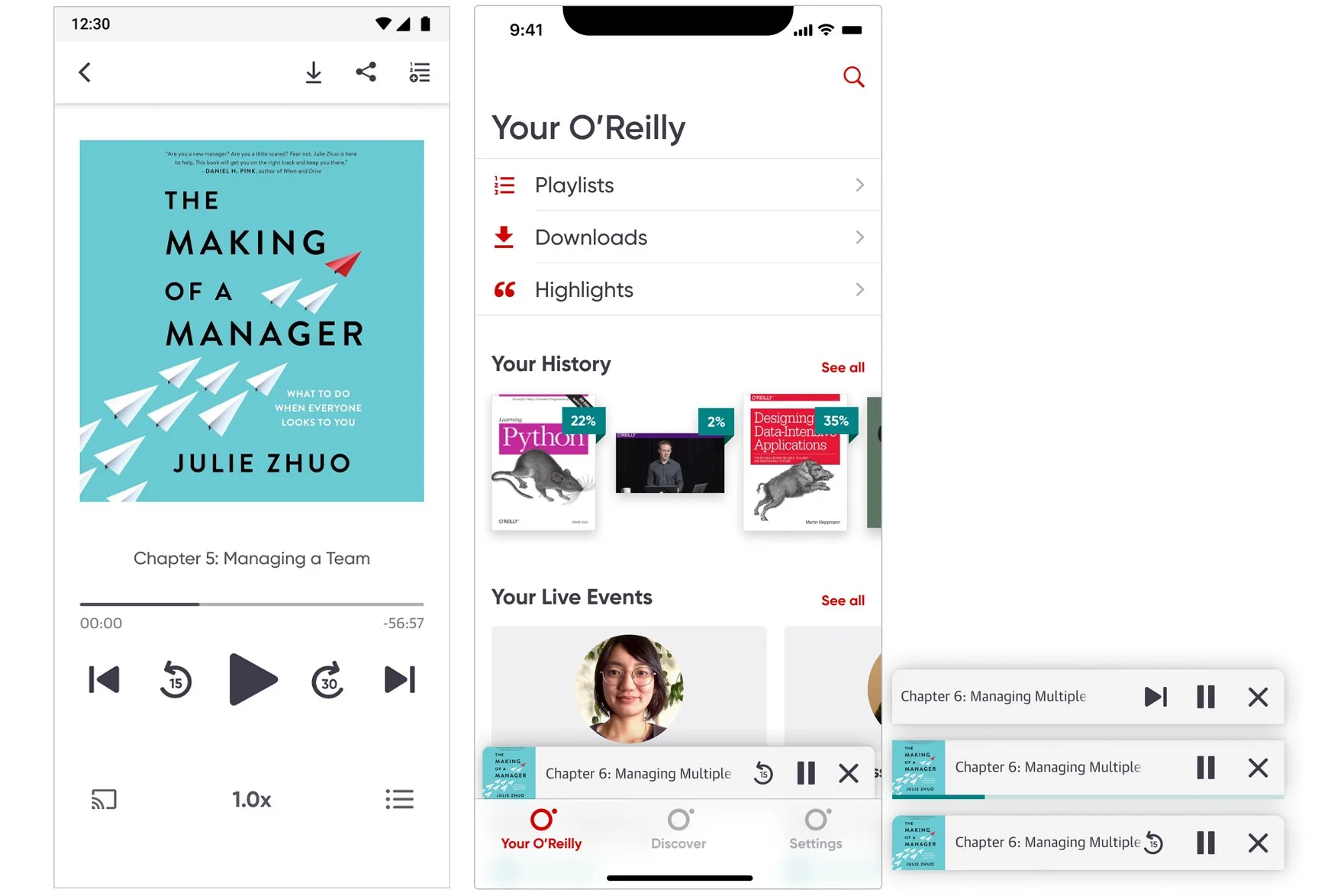
Partnered with engineering to validate feasibility and turn research-backed feature list into an MVP. I prioritized 5 features beyond core playback based on engineering feasibility and direct evidence from user feedback and behavioral data: background playback, lock-screen controls, chapter navigation, speed control, and a mini-player to support multitasking.Designed for cross-platform consistency with platform-specific intelligence
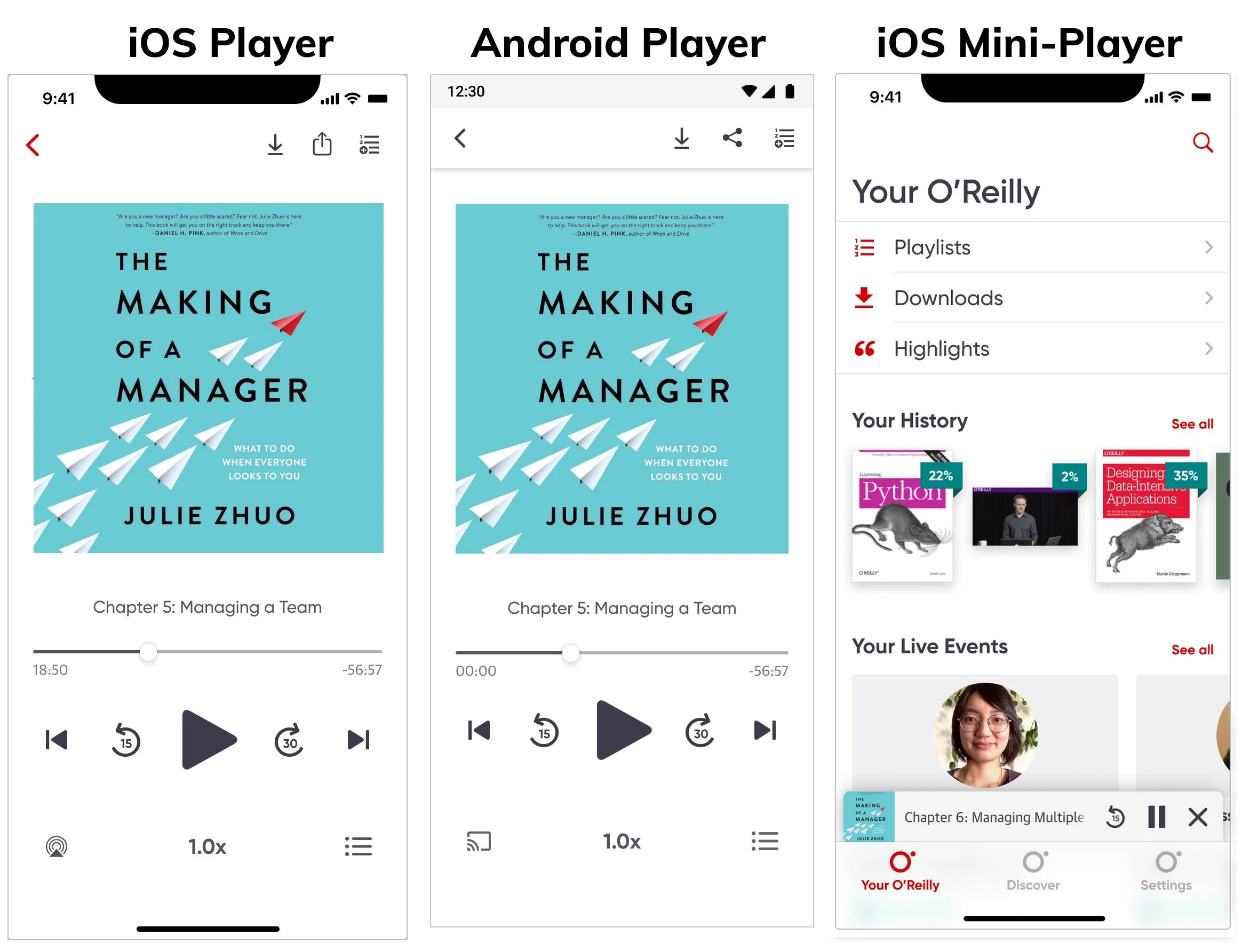
To ship cohesively across iOS and Android while respecting native patterns, I designed a shared icon set between SF Symbols and Material, maintained consistent interaction logic, and used each platform's native conventions for system-level controls.
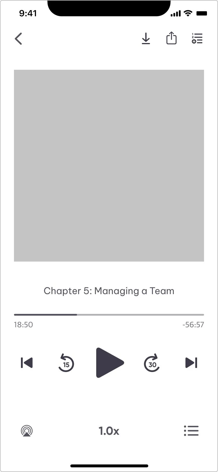
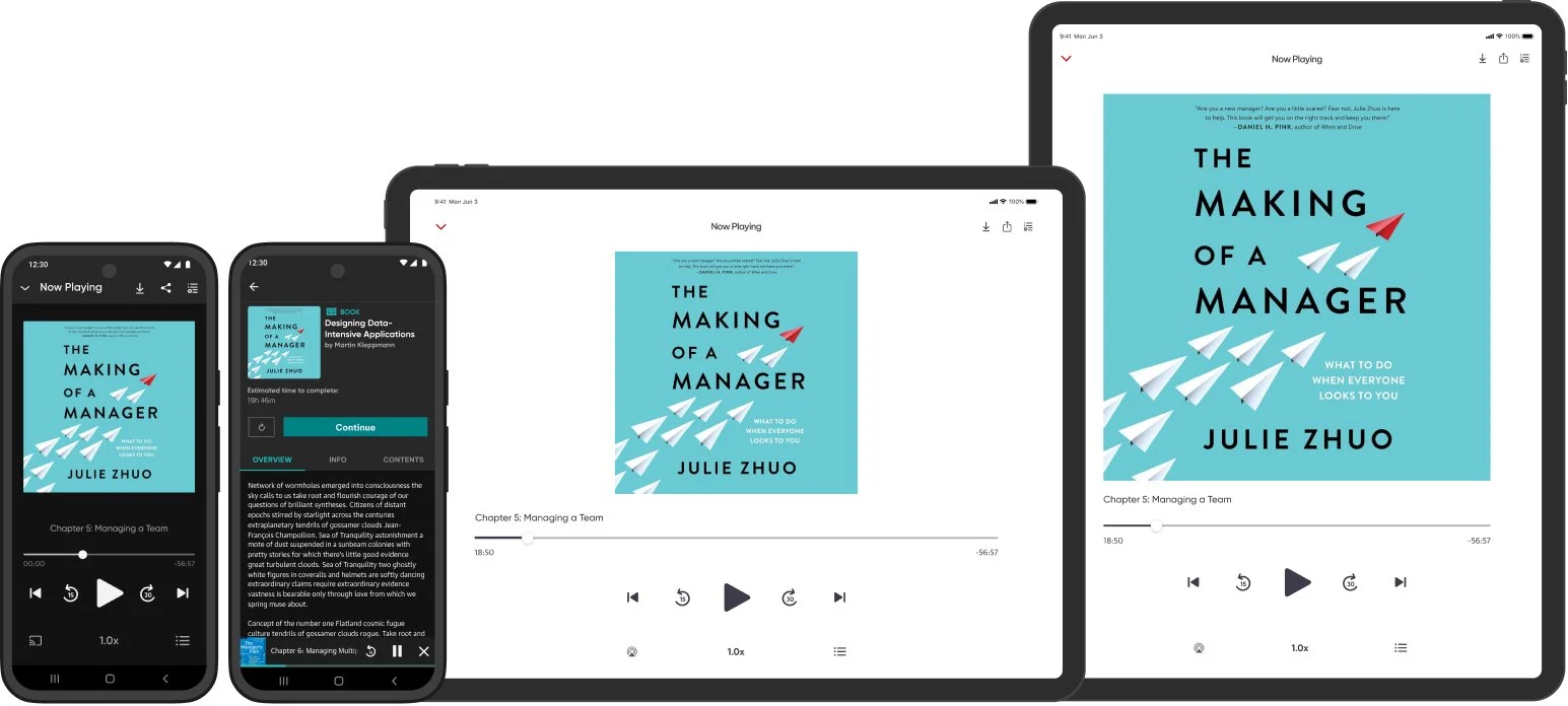
MVP Scope (what shipped)
Full-screen audio player with playback fundamentals (play, pause, scrub, chapter navigation)
Background playback and lock-screen controls (native to each platform)
Persistent mini-player for multitasking
Speed control and chapter skip buttons
Fast follow: Dark mode implementation
Fast follow: iPad and tablet devices
Fast follow: Sleep timer, bookmarking, and advanced Siri-enabled accessibility
Impact
150% increase in audiobook downloads and consumption within first two quarters
Doubled overall app usage across iOS and Android
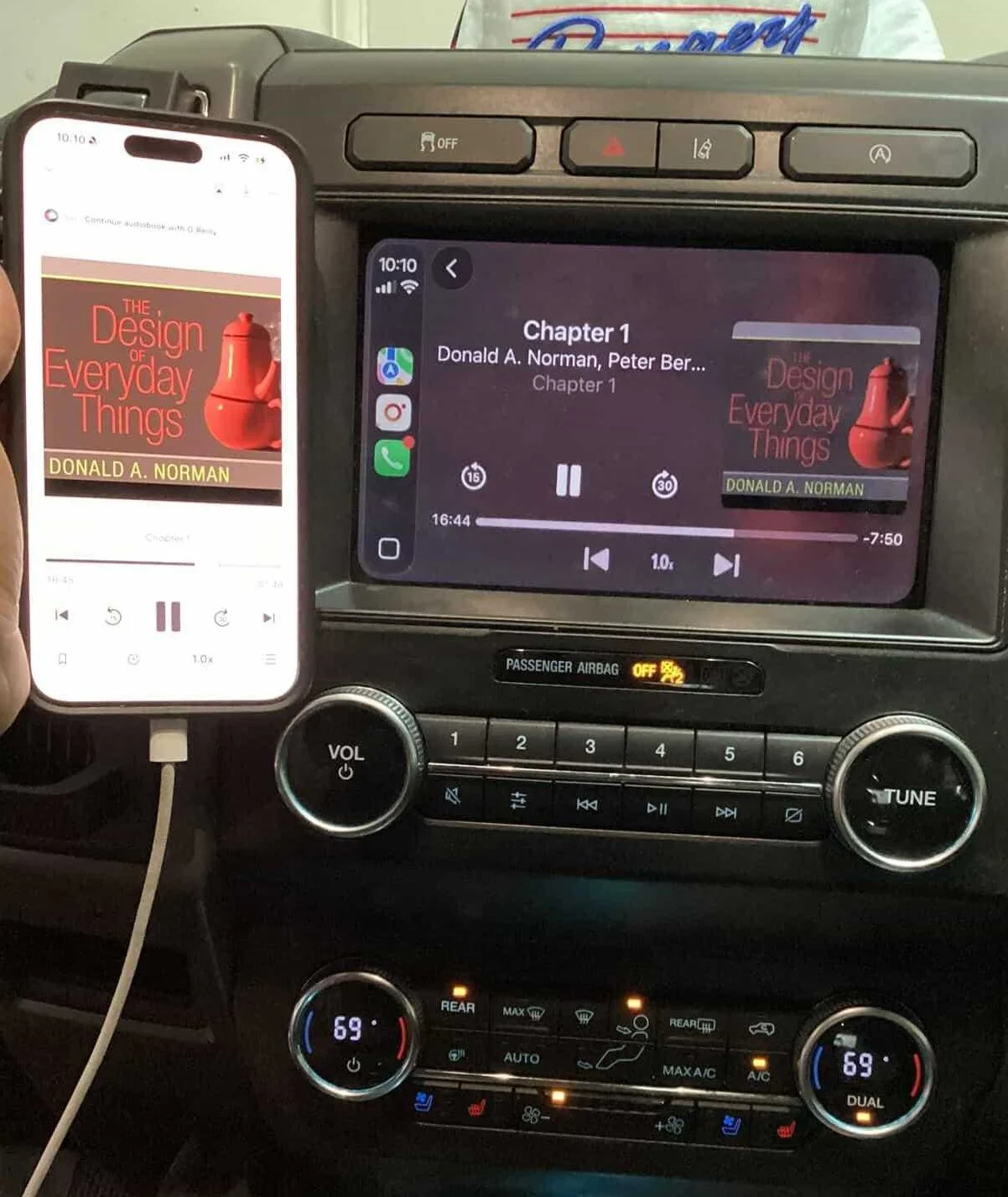
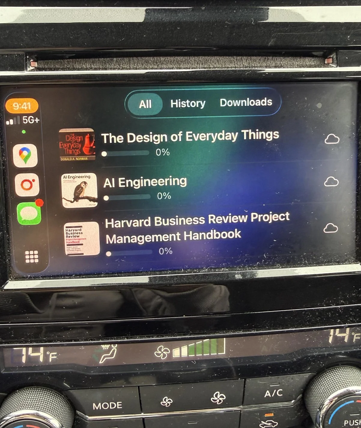
Extended to CarPlay post-launch for omnichannel listening across mobile, tablet, and automotive contexts
Reduced early-session abandonment
Context
O'Reilly launched audiobooks on the native app using the existing video player as a workaround. Once it hit real users, the native team's Slack channel that streams App Store reviews was immediately flooded with complaints which was a clear signal the experience wasn't meeting basic listening expectations.
Problem
Launching in the video player experience broke core listening behaviors. Users could technically play audio, but they could not reliably listen the way they expected to on mobile.
My role
I was the lead product designer on the native app team and took ownership of this 12-week initiative, driving key product and UX decisions from discovery through launch. I partnered closely with the Product Manager, Lead Engineer, and an 8-person engineering team split across iOS and Android to align scope, constraints, and timelines.
Exploring the problem
I owned the initial diagnosis by diving into App Store and Google Play reviews and synthesizing them into clear, actionable themes. I paired that with behavioral analysis in Amplitude and FullStory, which showed the audiobook funnel breaking down. Users hit play, entered the player, and abandoned within seconds, with repeated play attempts and low listen-through.
To define what a real player needed to look like and avoid rebuilding the wrong solution, I ran a landscape analysis across 15+ leading audio apps in education and entertainment, testing end to end to compare core listening behaviors. Based on that research I created a list of potential MVP features.
Feature choices and tradeoffs
I partnered with engineering to validate feasibility and turn my research-backed feature list into an MVP we could realistically ship. I led an impact vs. effort exercise with both iOS and Android engineering teams to weigh user value against backend complexity, then used that framework to define scope and make tradeoffs explicit.
Strategic Feature Prioritization
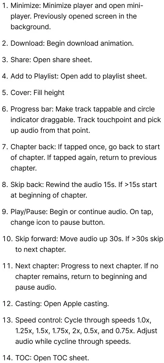
After working sessions with engineering, I made the call on MVP scope. I prioritized five features beyond core playback. Background and lock-screen controls surfaced in 64% of negative App Store reviews and were the single biggest retention barrier. Chapter navigation, scrubbing, and variable speed control were table-stakes as every leading audio platform contained them and were expected behaviors. Due to our users listening to audiobooks on the go, multitasking was also required.
Sleep timer, advanced bookmarking, and voice control were documented for the roadmap and deferred due to backend complexity and timeline risk.
Designs and critique
Flows
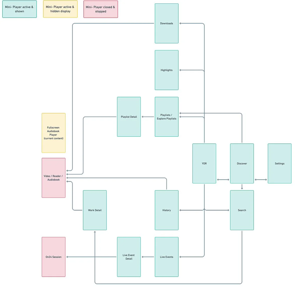
I created end-to-end user flows to define how listening worked outside the player screen, mapping key entry points (audiobook detail, search, library, downloads, and resume listening) and designing rules for when the mini-player appears, persists, and hides. I also defined interaction edge cases like background behavior, interruption recovery, and back navigation so listening stayed continuous and predictable.
Layout Exploration - Interface
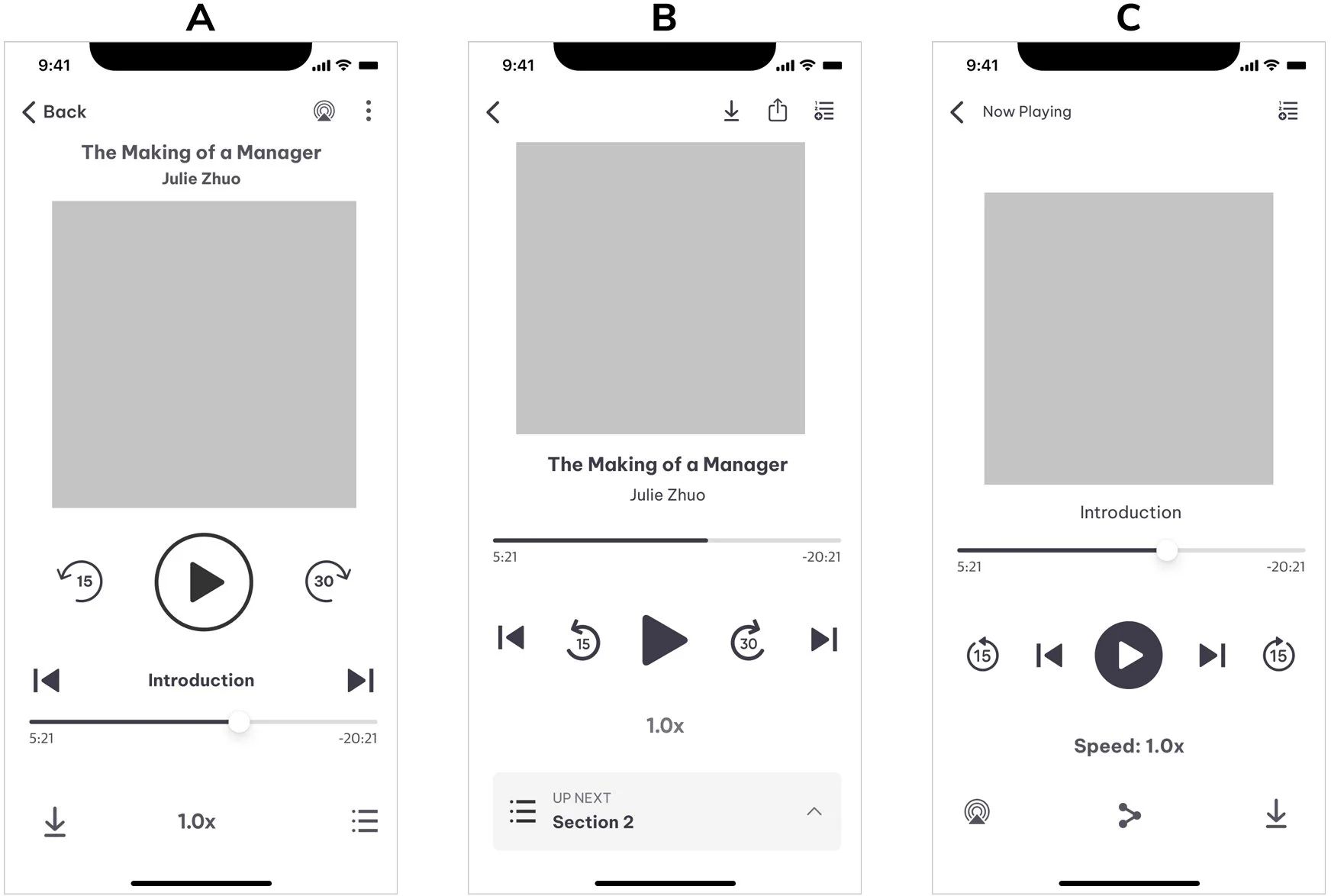
I explored three layout approaches to balance discoverability with mobile usability, focusing on control hierarchy and thumb reach. Version A grouped core controls at the one-third screen mark but left chapter skips segregated from related controls. Version B added a dedicated table of contents row but created a busy four-section layout. Version C moved utility controls to the bottom but isolated Add to Playlist in a way that overstated its importance. Consistent feedback from my design team was that all three still felt cluttered with unclear tap target hierarchy, so I refined a final direction that pulled the best of each: utility controls at top, chapter skips among core controls, and strategic placement of speed and table of contents which were informed directly by patterns I observed across Spotify, Audible, Pluralsight, and Libby.
Final low fidelity screen
High fidelity
Because we were shipping on two platforms, I designed for consistency. I kept the interaction model aligned across iOS and Android while respecting OS-specific patterns where they mattered. To bridge the two design languages, I designed a shared icon set that sat between SF Symbols and Material iconography and validated recognizability through testing. For system-familiar actions like share, cast, and minimizing the player, I used each platform's conventional icons and behaviors already established elsewhere in the app.
For the mini-player, play/pause and close were non-negotiable. For the third control tool on the player, I evaluated chapter skip, speed control, and 15s skip back. Research showed that 91-94% of users browse while listening which helped me decide on the 15s skip back; it could help active multitaskers replay content they might have missed.
Usability Testing
I owned usability testing end to end. I wrote and launched the screener in GreatQuestion, set up an A/B test in Maze using Figma prototypes, and selected 16 screened participants - 8 per variant. Variant A included chapter skips inline with core controls and no scrubber affordance. Variant B removed chapter skips for a cleaner layout and added a scrubber circle indicator for clear interactivity.
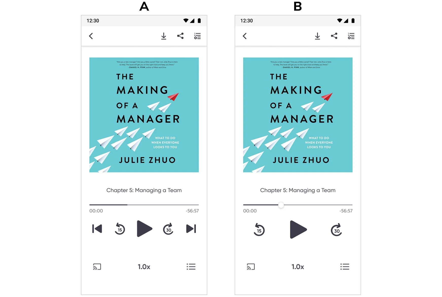
3 of 8 Variant B participants independently asked "How do I skip to the next chapter?" validating chapter navigation as a core listening need worth the added UI density. Across both variants, 100% recognized the mini-player as interactive and 95% understood both playback speed and the new iconography without instruction.
Testing also revealed a hierarchy issue: chapter skip buttons were the same size and weight as the 15s/30s skip buttons, creating competition and confusion about which controls were primary. I increased the play/pause button size by 20%, moved chapter skips slightly outward for breathing room, and adjusted visual weight with a lighter stroke to establish a clear hierarchy of primary skip over chapter navigation. A follow-up walkthrough with 3 additional participants confirmed all could distinguish "skip within chapter" from "jump to different chapter" without hesitation.
Documentation and release strategy
I created comprehensive handoff documentation and interactive prototypes so engineering could build without losing design intent across iOS and Android. I proposed a staggered release plan, releasing the core audio player first and mini-player as a fast follow, and extended the phased approach by documenting sleep timer, bookmarking, and advanced accessibility for the roadmap. During build, I led design QA across both platforms, auditing layouts, spacing, typography, and icon behavior, validating tap targets and state changes, and triaging issues with the lead engineer so the shipped experience felt cohesive across devices.
Results
Before the redesign, users would hit play and drop off within seconds because the video player workaround broke basic listening behavior. After shipping the dedicated audio player, we saw a clear shift in engagement.
Within the first two quarters post-launch, audiobook downloads and consumption increased 150% and overall app usage doubled across iOS and Android. Analytics reflected reduced early-session abandonment and stronger listen-through behavior, directly tied to the original problem.
CarPlay
Post-launch, I led the CarPlay integration, adapting the audio player for automotive contexts within Apple's Now Playing interface templates. This work focused on strategic UX decisions: determining which features to expose, prioritizing metadata for driver glanceability, and ensuring safe interaction patterns rather than visual design, as CarPlay enforces strict UI guidelines.
Takeaways
I didn’t have “official” research for this project - I had to grab at every signal that I could through Amplitude, FullStory, AppStore and Google reviews, and ample competitive analysis. Altogether, that research allowed me to see the bigger picture and understand the needs and wants of audiobook listeners and learners.
Scoping this MVP taught me that clear goals set early are what keep a backend-heavy project from drifting. Constant dialogue with engineering helped me understand platform behaviors, communicate intent clearly, and prevent late-stage changes. Proactively engaging stakeholders to reduce ambiguity shaped solutions that balanced feasibility with user experience, and that instinct carried through every phase of this project.