
Connecting 40,000 Senior Citizens to Their Local Community
Connecting seniors to local community through a Directory MVP that shipped during a period of 13× membership growth.
Quick Overview
About
The Group Directory was a searchable member directory built for Grouper’s platform, designed to help members, who were senior citizens, find and connect with others in their wellness groups. I was the sole designer on the project, owning everything from research through delivery. The Directory helped to scale the platform from 3,000 to 40,000 members in 7 months after launch. The work centered on balancing discoverability and ease of connection within a health and wellness context.
Role & Context
Solo Product Designer, partnering with PM, Lead Engineer, and 4 rotating engineers.
Timeline: 20 weeks → 8 weeks → 6 weeks (scope compressed 70% mid-project)
Constraints
Platform rebuild during rebrand, rotating engineering teams, no research budget, timeline collapsed twice due to contract changes.
3 Strategic Decisions
Grounded design in real senior citizen behavior
I volunteered for 5 weeks with Walk with a Doc and ran 5 behavioral observation sessions watching members use their own phones and watches to understand tech comfort, trust signals, and decision habits.Translated research into confidence-building discovery
I spent time conducting 14 surveys and 6 interviews plus behavioral observations, which surfaced first-time joiner anxiety and logistics-first decision patterns that shaped filter strategy and detail page structure.Protected the discover → evaluate → save → contact loop through 2 brutal scope cuts
I advocated to preserve the full behavioral flow over feature breadth, ensuring a shippable MVP despite cutting filters, images, the Profile page, and roughly 70% of planned scope.
MVP scope (what shipped in Jan 2025)
Browseable Group Directory
Logistics-first filters such as location and cost
Group Detail page designed to reduce uncertainty (“what to expect,” logistics upfront)
Save entry points + clear contact CTA
Key states as applicable: empty, no results, loading
Impact
13x membership growth: 3,000 → 40,000 members by July 2025 (shared internally post-departure; confirmed via Chief Product Officer).
Design system acceleration: Co-built Figma + Storybook component library (12 → 22 components) used across Directory, onboarding, and back office.
Sales enablement: CPO shared that Optum referenced Directory as a partnership differentiator.
Research
With no research budget and having never designed for the senior citizen demographic before, I used Walk with a Doc, a free weekly walking program for senior citizens that was sponsored by Grouper, as a research channel. I combined 14 surveys, 6 interviews, and 5 in-the-wild behavioral observation sessions by watching members use their own phones and watches. This experience gave me direct access to the audience in a natural setting and grounded decisions in real senior citizen behavior: tech comfort levels, trust signals, and how members actually made decisions about joining something new.
Two insights drove the core design decisions. First, uncertainty was the primary barrier to joining or attending a group function for the first time. Members needed to answer "Will this work for me?" before investing emotional energy, so filters should be designed around logistics and fit cues like schedule, location, intensity, accessibility, and group size rather than search efficiency. Second, first-time joiner anxiety was universal. Members needed trust before commitment, so the group’s page should be structured around the questions participants repeatedly asked: "What happens when I arrive?" "Will I fit in?" "What do I need to bring?"
MVP & Tradeoffs
That research also showed members rarely commit on first exposure - they discover possible groups, evaluate the fit, save promising options, and feel more comfortable moving forward if there’s a way to communicate with the group leader beforehand. I partnered with Product and Engineering to define an MVP anchored in that loop: discover → evaluate → save → contact. Features like email nudges, communication tools, and personalization were intentionally deferred as each introduced dependencies that would need to be saved for post MVP.
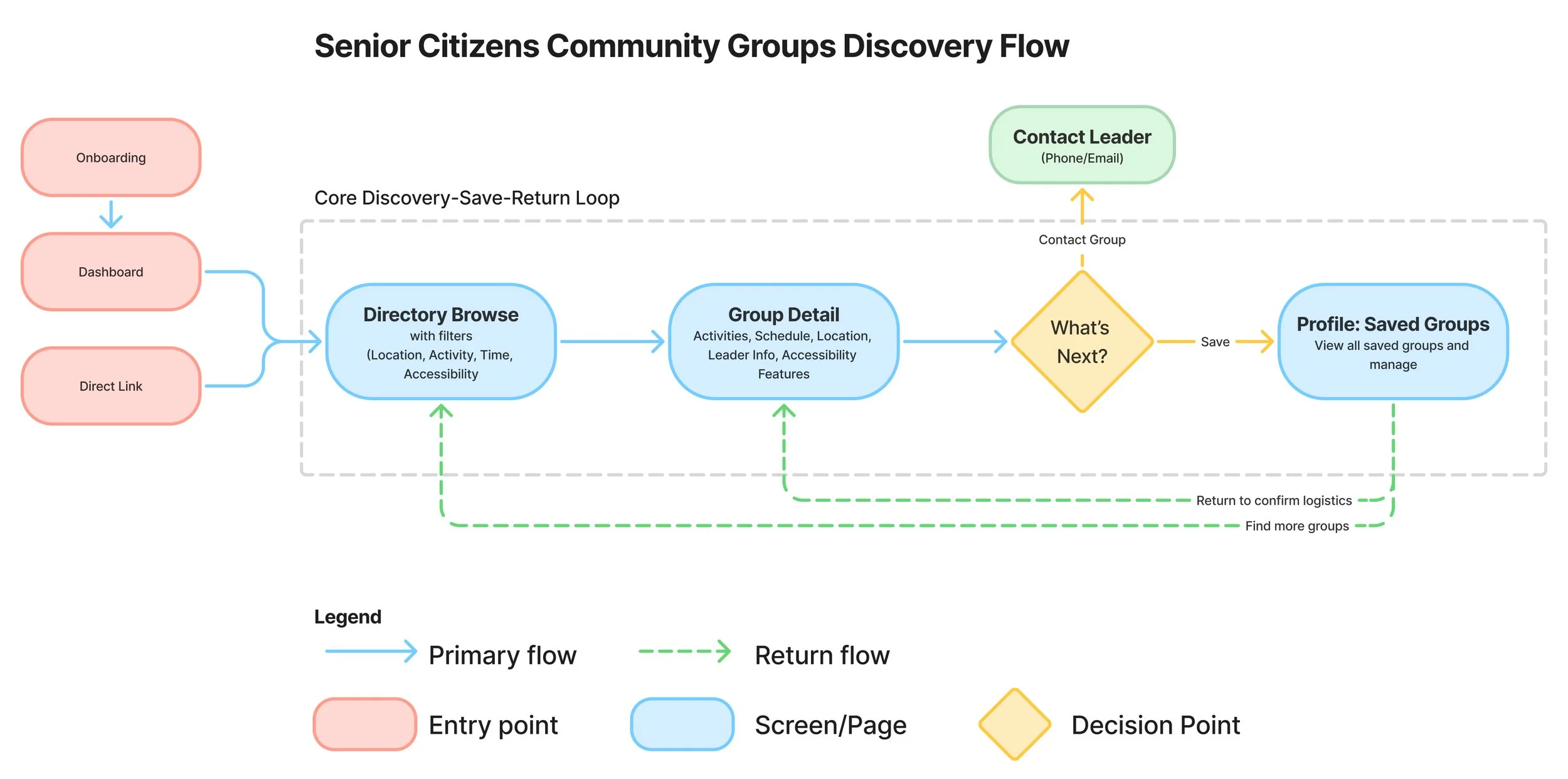
Flows
I mapped end-to-end flows for the Directory landing, group detail, and saved groups experiences, ensuring each path had a clear next step and that empty and no-results states were accounted for. I reviewed feasibility early with engineering so flows could scale with the platform.
Low-Fidelity Exploration
Given the audience, I designed for readability, predictability, and confidence: clear hierarchy with logistics first, large and consistent CTAs, plain-language labels, and guidance for empty and no-results states. I prioritized legibility and contrast for key actions and used "what to expect" content to reduce first-time joiner anxiety.
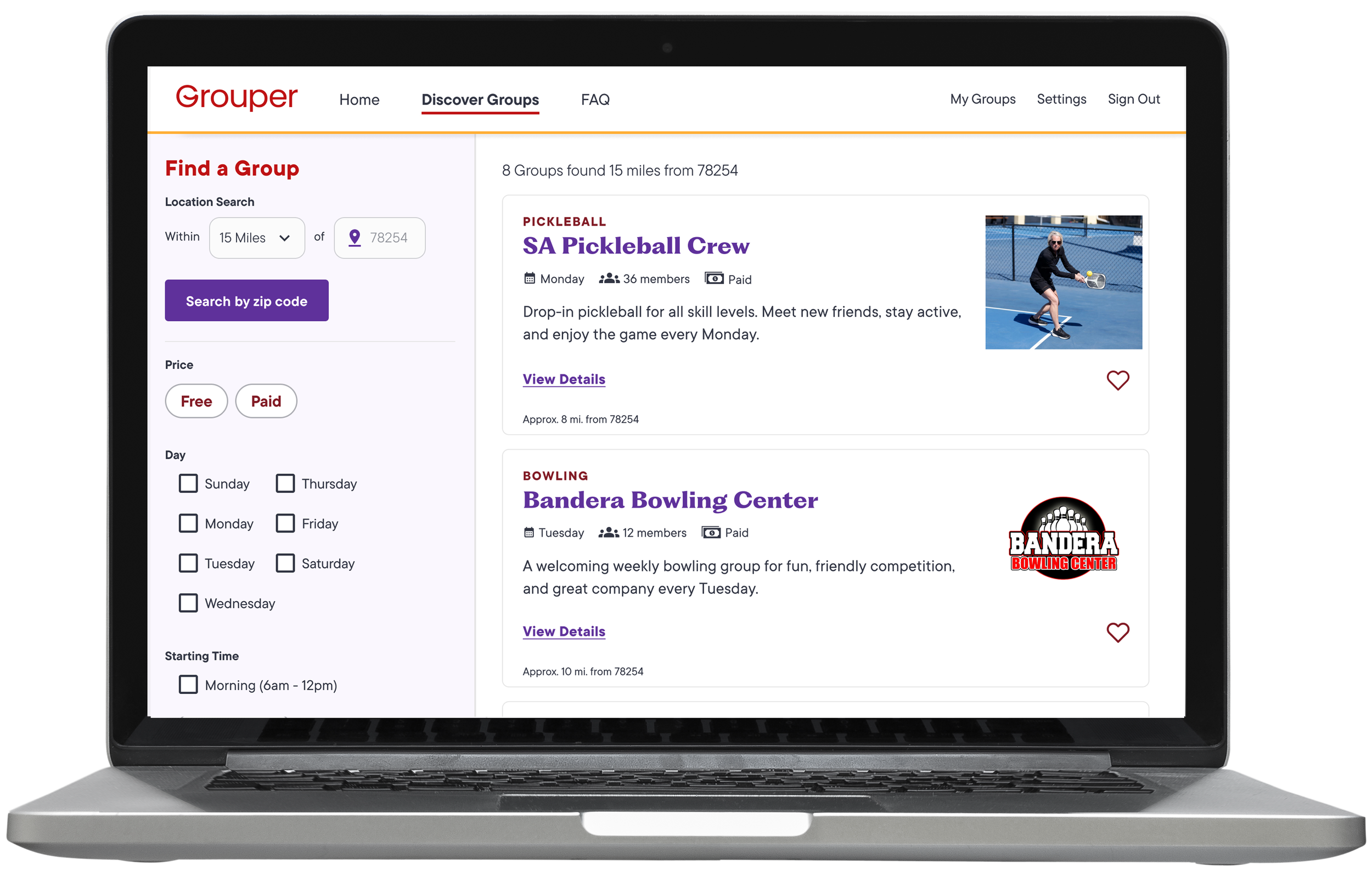
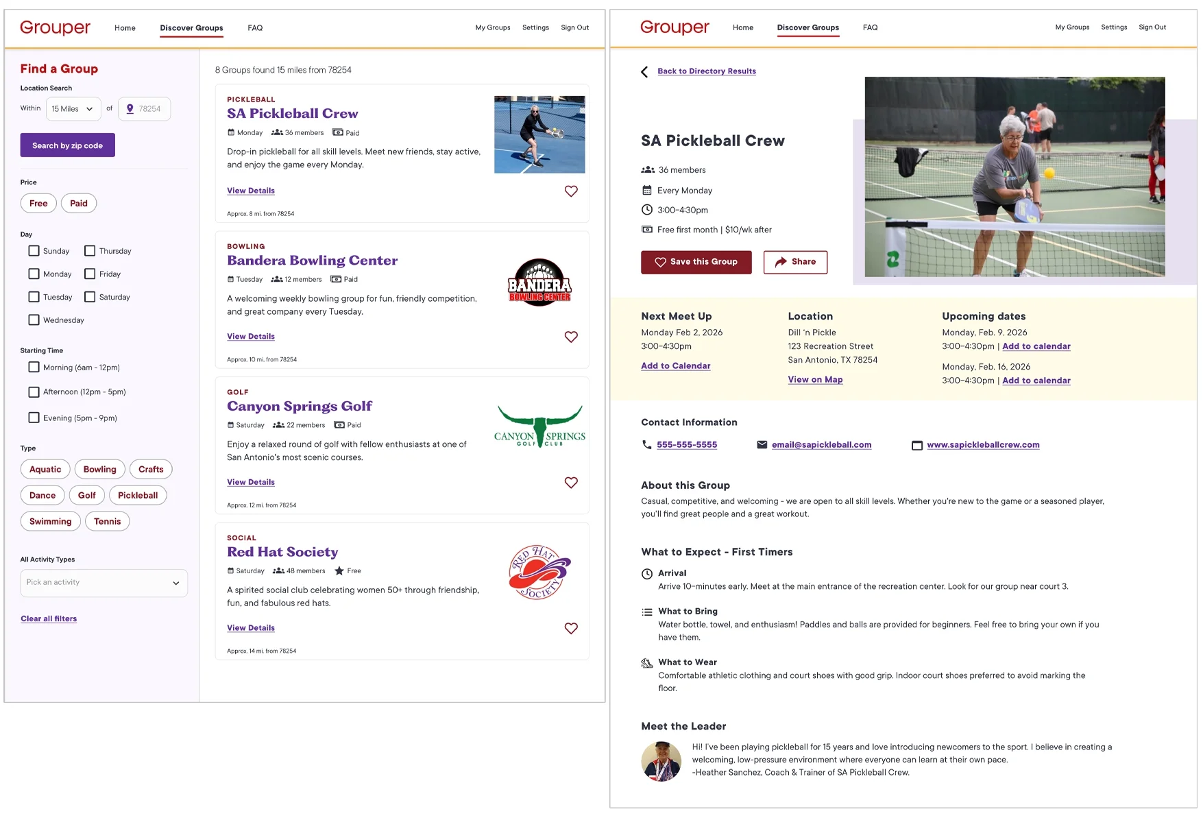
Directory browse/search page (Discover)
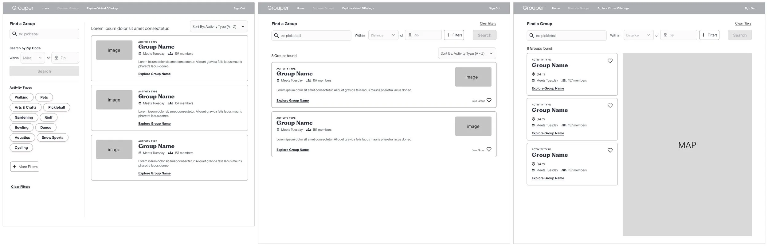
I explored three layouts to balance filter visibility with usability. V1 used a sidebar with list view, which was likely familiar, but the narrow sidebar limited filter visibility and heavy scrolling made comparison difficult. V2 moved filters to a top expandable panel which reduced clutter, but hiding a majority of the filters behind a button added unnecessary friction. V3 led with a map and encouraged location-based discovery, but members made decisions using multiple factors outside of their location. I refined V1 by widening the sidebar to keep critical filters visible at all times and switched to a card grid so logistics were scannable and easier to compare. Testing the filter list categories and length would likely be an on-going project.
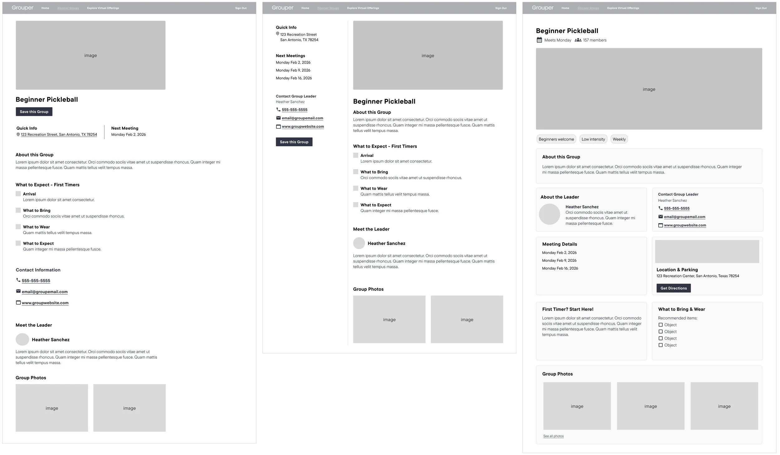
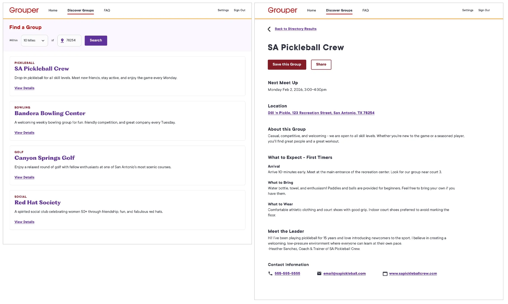
Group Detail Page
I explored three structures to support members making decisions about the group. V1 used a compact single-column layout which kept the page very simple and streamlined, while surfacing the important group information at the top. V2 used a persistent sidebar similar to the landing page, surfacing and separating the important meeting information inside the left column. V3 was the most comprehensive as it was built around modularity and tagging, but the hierarchy got lost with prominence placed on every section and gave the page a heaviness that might come across as overwhelming. I ended up with a hybrid of V1 and V2. The two column worked to surface important information and merging into one column later in the page would bring the group details together to feel more cohesive.
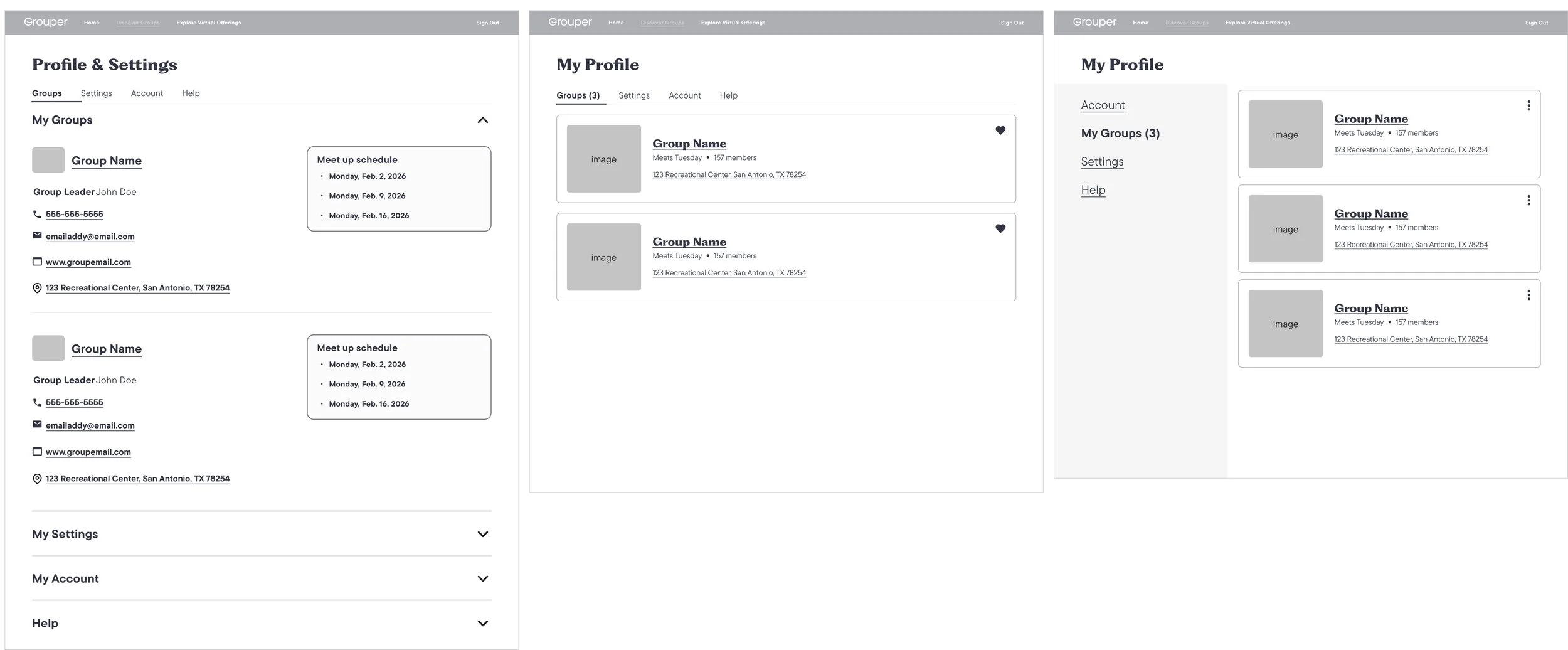
Profile/Saved Groups Page
Once a user saved a group, the group was moved to the Profile & Settings page. For V1 I explored accordion sections which would minimize the amount of information on the page by using progressive disclosure. The My Groups section would stay open by default. V2 utilized horizontal tabs to keep the page organized and segregated into clear sections. The cards from the landing page could be repurposed as well. V3 had a navigation column, again similar to the landing page and detail page explorations. This could help to balance logistics visibility with simplicity. I went with V1 because the Dashboard was using the dropdown and wanted to follow patterns that were being established within the platform.
Design Iteration
Between lo-fi validation and hi-fi execution, two stakeholder concerns shaped refinements.
Filter scalability for growth
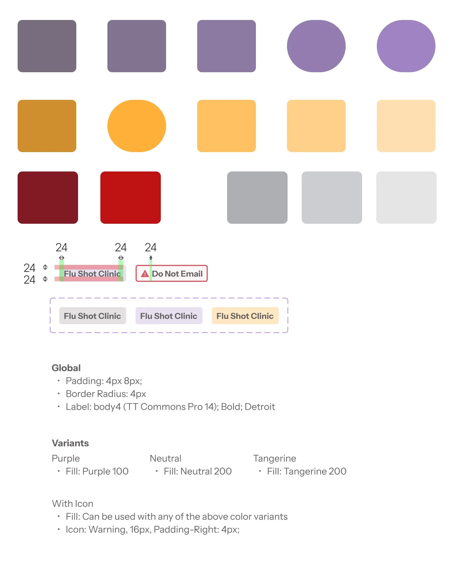
My PM raised a discoverability concern as the activity list was expected to grow significantly - all activity types were enclosed in a dropdown, making them hard to browse. I proposed a hybrid: top activity types as browsable chips, with a scalable dropdown handling the rest. It solved both problems without sacrificing either goal.
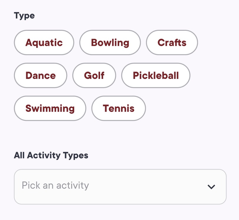
For scalability purposes, I tucked all the activity types within a dropdown. This could make discovery difficult so based on feedback, I surfaced the top 8 activity types so they could easily be selected.
Saved groups visibility
A stakeholder flagged that saved groups on the Settings & Profile page needed more prominence than the accordion pattern allowed, and that members shouldn't risk accidentally closing the tab, so I pivoted to V2. While I could have removed the chevron from the My Groups section, I wanted to separate the information to avoid possible confusion within the page, and moving information into separate tabs would help accomplish that.
High-fidelity design
Once lo-fi structure was validated, I executed high-fidelity screens. Visual refinement happened primarily through the component system that I co-built with the Lead Engineer like buttons, cards, and badges. Engineers could reference Storybook and apply styles consistently across Directory to improve coherence and accelerate implementation.
Landing Page
Details Page

Saved Groups
Quick Pivot
The Directory faced two major scope reductions due to contract changes and engineering constraints. Across both cuts, I identified that the priority was protecting a loop that could ship and be measured: discover → evaluate → save → contact.
Scope Cuts
Scope cut 1: Mid-implementation contract change
Halfway through development, a contract change required immediate descoping. Filters were reduced to zip code search, price, and starting time which were the easiest to implement, all images except the landing page were removed, card attributes were distilled down to the day only, and the full Profile page was cut. I advocated to move saved groups onto the Dashboard in a "My Groups" section rather than scratch save behavior entirely, protecting the return path. Research had clearly indicated that members needed to save their group to return to later, and had been included in the primary loop.
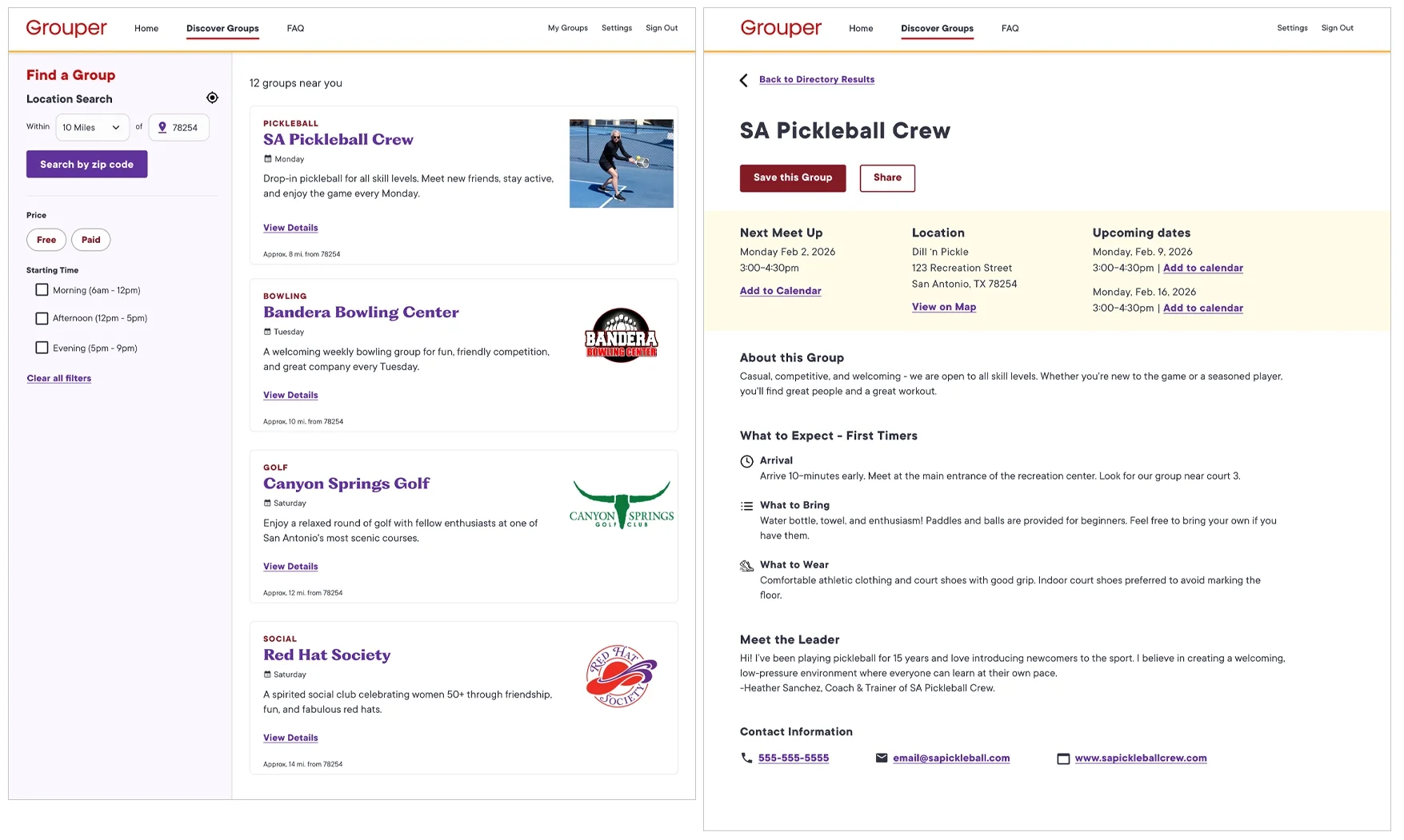
Landing Page - Scope Cut 1
Detail Page - Scope Cut 1

Saved Groups - Scope Cut 1
Second Scope Cut
Shortly into the revised build, engineering scheduling required additional cuts. On the landing page, the sidebar filters were moved to the top of the page because it was faster to build, the filters were reduced to zip code only, and the card attributes were removed entirely. The detail page was also streamlined into a single column and the logistics summary moved into the page body. I preserved contact information on detail pages and maintained save and share throughout the platform, keeping the critical actions for participation even as everything around them was simplified.
Landing Page - Scope Cut 2
Detail Page - Scope Cut 2

Saved Groups - Scope Cut 2
Design QA
I led design QA through daily reviews of staged builds, triaging issues in Jira with the PM and partnering with engineering to prioritize visual polish so the product shipped at a high quality standard despite extreme scope compression. In the rush, it would have been easy to miss certain design details so I took it upon myself to ensure all possible edge cases and states were reviewed prior to shipping.
Design System Foundations
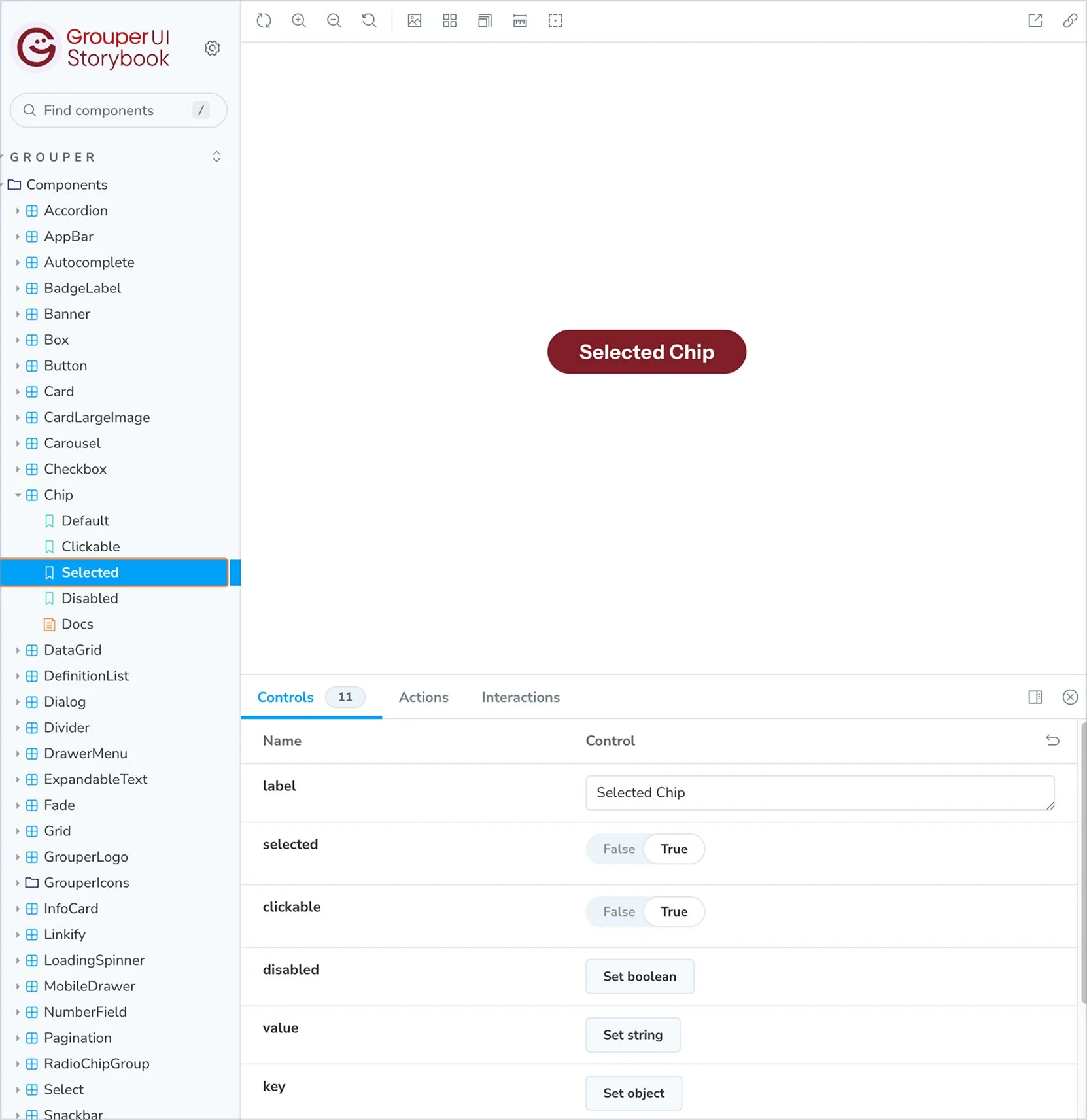
During the Directory work I noticed growing inconsistencies across the product as the company was growing and new apps were being developed. I partnered with the Lead Engineer to establish a shared Figma and Storybook component library to avoid different engineering teams duplicating component builds. The Lead and I discussed a variety of ways to build out the library, but in the end decided on using Storybook. Storybook would give engineering a development-ready reference which could be used in conjunction with handoff documentation that linked directly to built components. We would meet up and discuss standardizing patterns as the product scaled. The library grew from 12 to 22 components as Directory work surfaced new patterns, and was used across Directory, onboarding, and back office.
Outcome
By July 2025, membership grew from roughly 3,000 to 40,000 (shared internally after I left, confirmed via the Chief Product Officer). The Directory shipped during this period as a key discovery surface for new members. The CPO also shared that Optum referenced the Directory as a partnership differentiator in enterprise conversations.
Instrumentation to track filter usage, save rates, and contact clicks was planned during the initial MVP scope but delayed by the final scope cut. Before leaving, I documented the measurement plan and v2 priorities which were personalization and communication features deferred from the MVP, so the team could pick up where the work left off.
Takeaways
Shipping under extreme compression taught me that protecting a core behavioral loop is more valuable than preserving feature breadth. Every cut decision came back to whether the discover → evaluate → save → contact path stayed intact. Working without a research budget pushed me toward more creative methods, and the Walk with a Doc sessions ended up being some of the most grounding research I've done. It was also exceptionally important to keep documentation and communication current throughout a high-flux build; it was what kept design and implementation aligned when everything else was moving.